BABY & TODDLER SHARED ROOM (A SNEAK PEEK!)
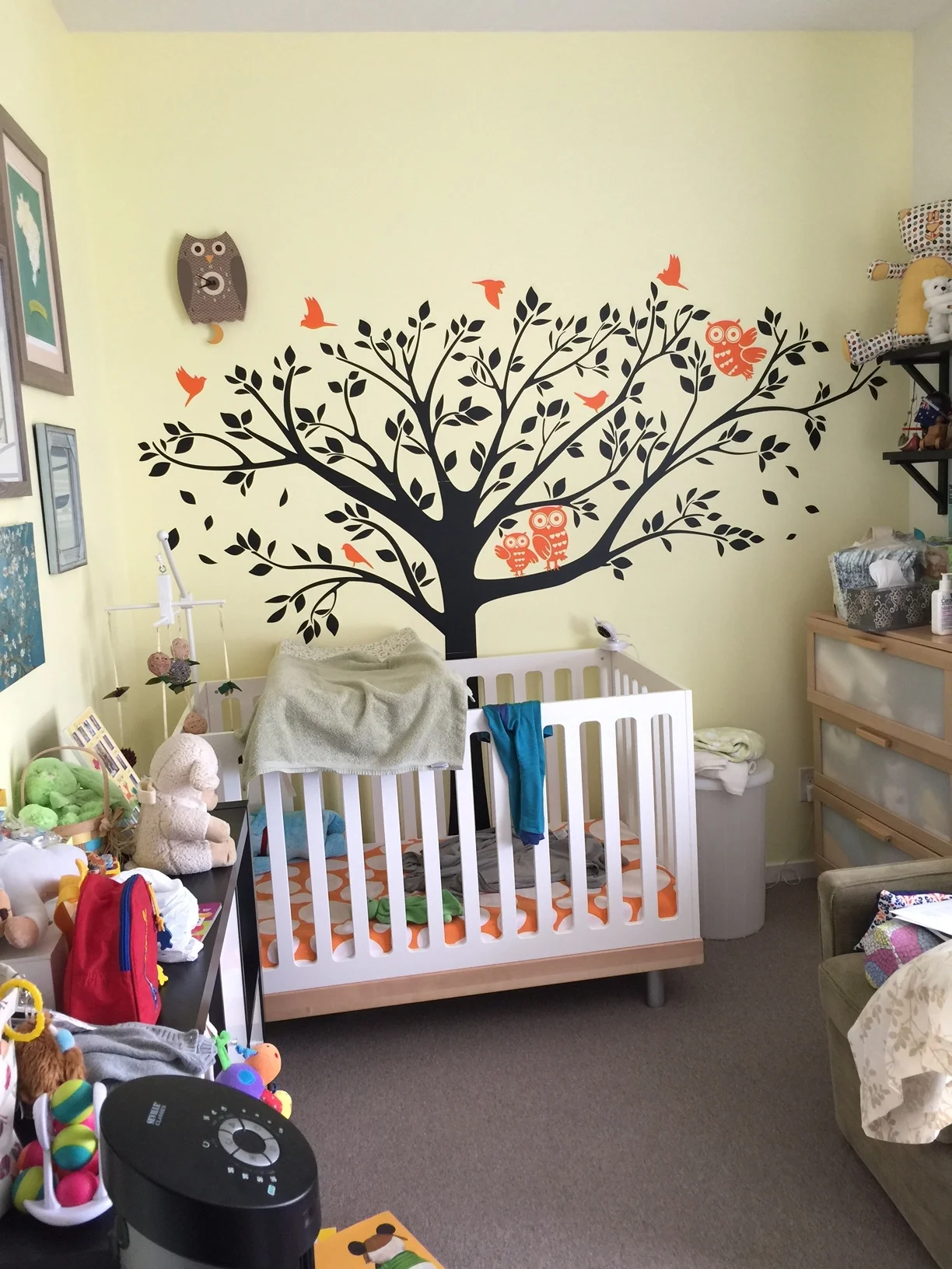
Last September I started working with a new client who was pregnant with her second baby, the first little one was a 2-year-old toddler boy. At the time, my client was feeling like the amount of stuff creeping into their lives from having a growing toddler was becoming overwhelming and she really wanted to get this sorted before welcoming the new baby. The brief was essentially to transform the existing nursery (photos below) into a big boy and baby shared room that was calm and uncluttered with enough floor space for the kids to play (design board above). The space was tight but I could absolutely see how we could make this little room fit what the family wanted!
The nursery as originally photographed:
Design wise, they wanted the space to feel bright and happy, using natural materials and keeping the room within a neutral colour scheme as they were leaving the gender of the baby a surprise until delivery. Functionally, they wanted access to both beds, some dim lighting for night time, access to toys and a play area on the floor. Given they already owned the beautiful Oeuf classic crib, it made sense to use this piece as the starting point for the room. The only other items that were a must keep were the curtains, as they had been custom made to fit the windows not too long ago.
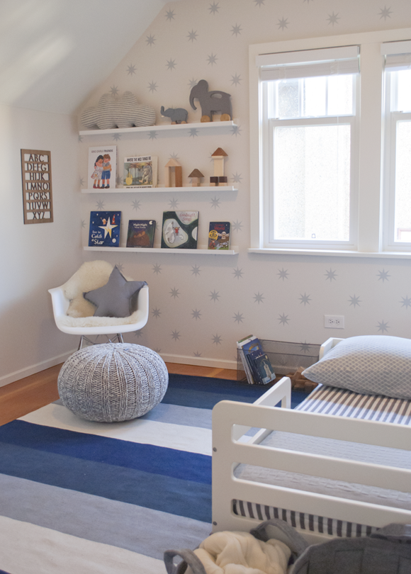
My client loved the idea of wallpaper but to keep costs contained, decided on these lovely star decals instead.
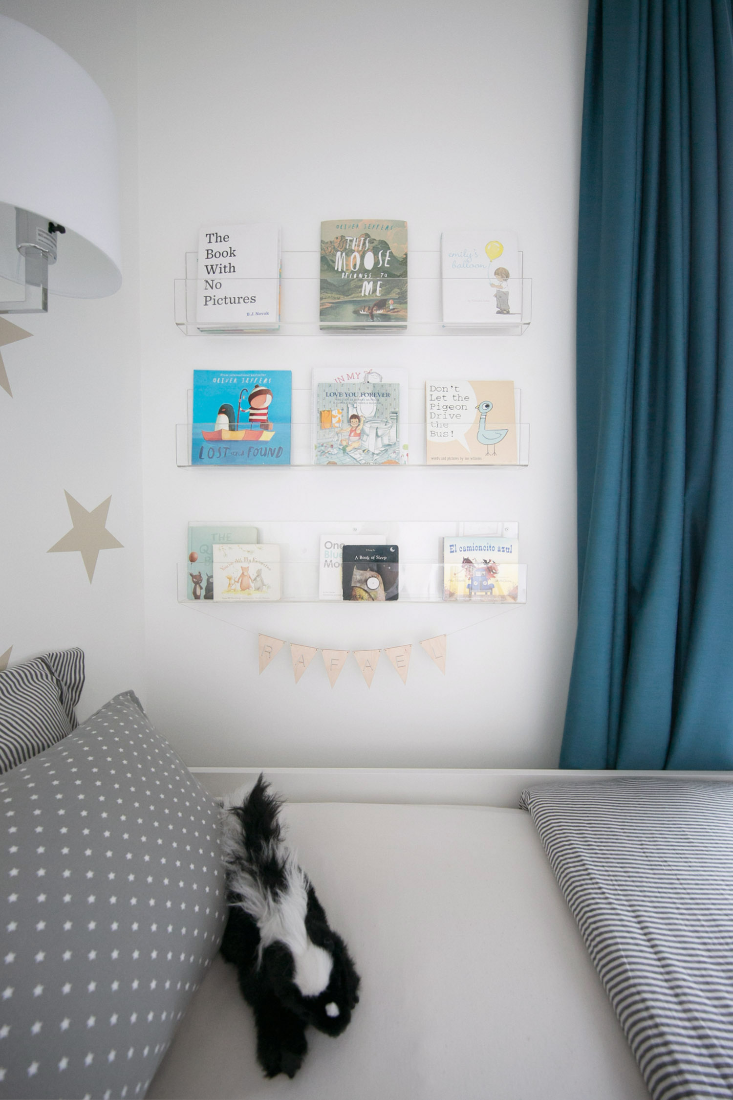
Below I'm sharing a sneak peek of what's to come in the full room reveal very soon!
I love how these clear shelves show the books as art and these gorgeous wood toys from Trae Designs are a local market find! Stay tuned to see the full room reveal that I am SO excited to share.
YOU MAY ALSO LIKE:


