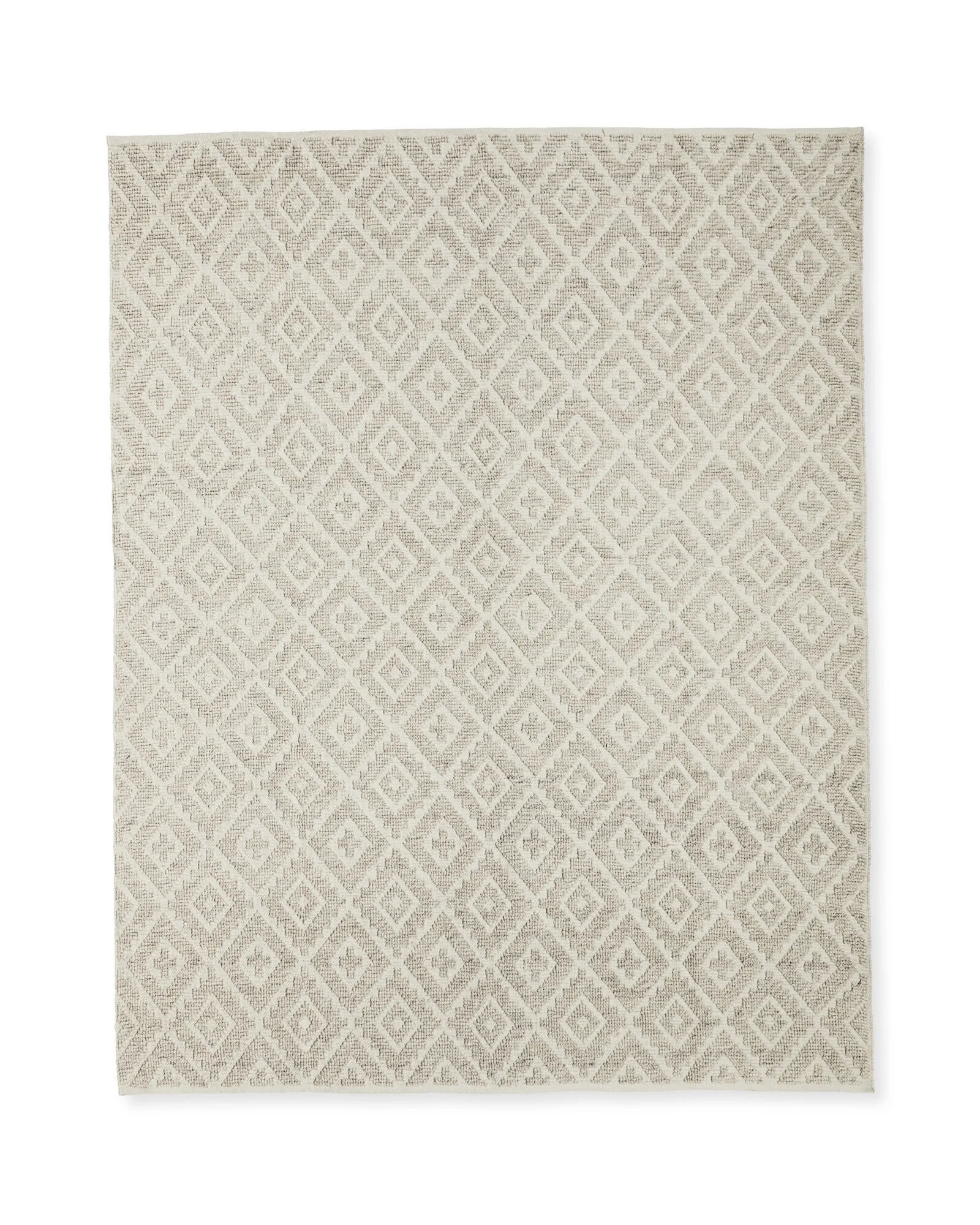
ISABELLA'S PINK, GREEN AND GOLD NURSERY REVEAL!
We finally have a new room reveal! The first space of 2023 and it was made for the sweetest baby. Without a doubt, nurseries are the most special places to decorate. The excitement of a newborn, the beautiful choices available for babies, and the love that you feel when you walk in the room. Isabella’s nursery was a dream to design and I feel so honoured to be a tiny part of this beautiful family’s beginnings.
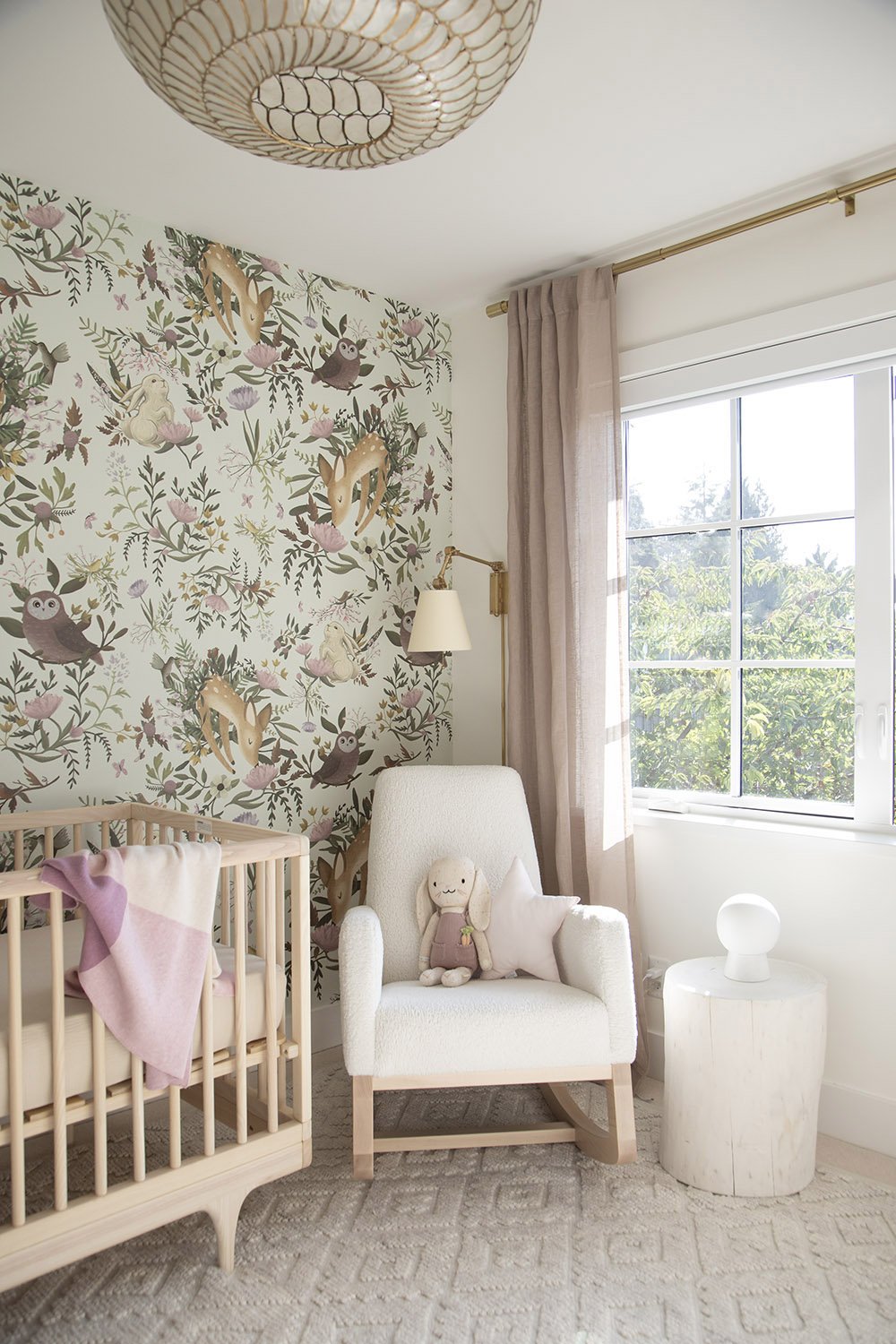
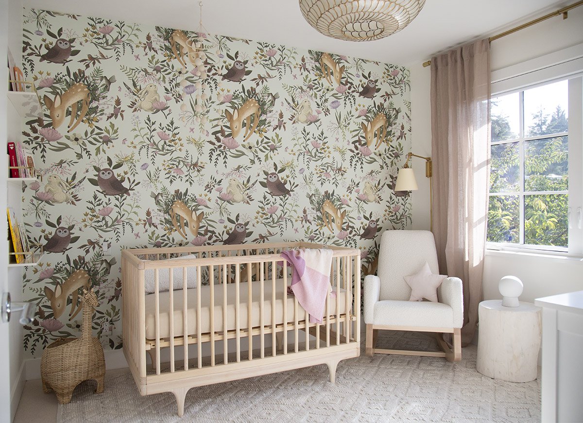
Isabella’s Mom has a great design eye and already knew that she wanted to include this forest wallpaper as a feature in the baby nursery so this was the piece that we worked with to create the rest of the dreamy space.
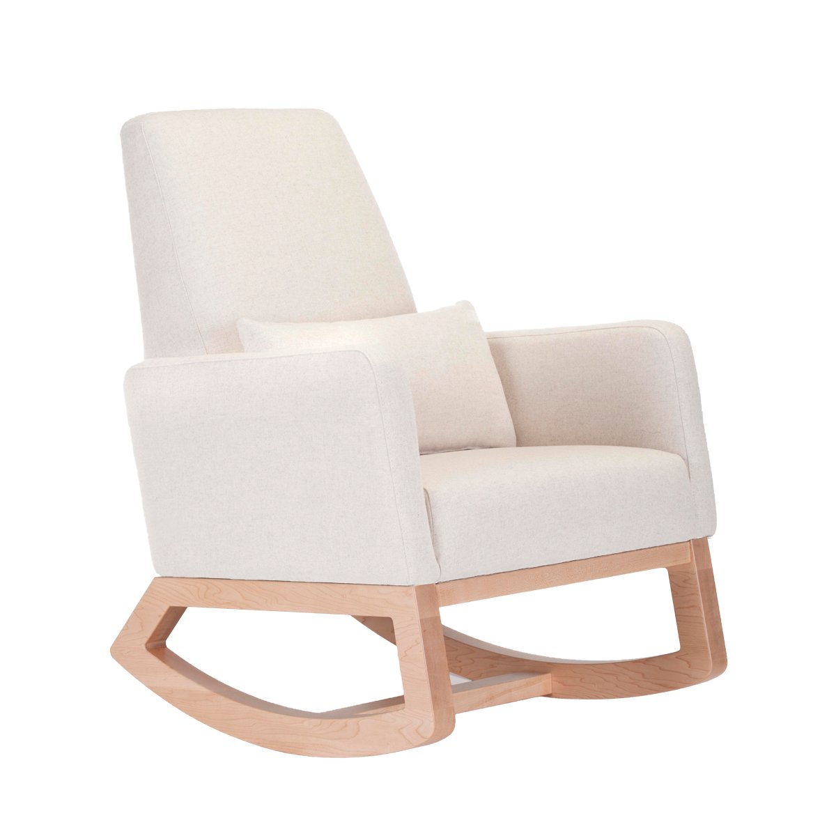
This room had been used as a guest room previously and the smaller space made it a perfectly cozy place to create a baby nursery. The gorgeous windows allow plenty of sunlight and we positioned the nursing chair in this corner for two reasons. The first was to be close to the crib, so feeding to sleeping transitions were made easier, especially at night. The second was the view from the window. When laying out a nursery, it’s essential to think about who will be spending time where and having the chair in this position allows both parents to hold baby while enjoying the forest view.
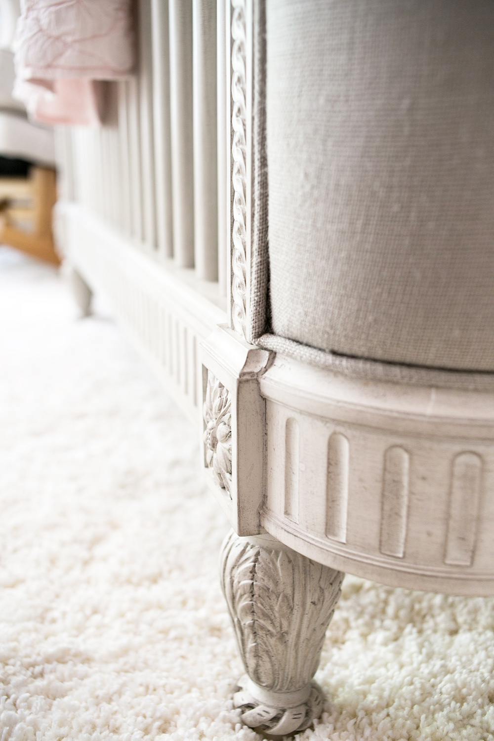
The crib is a forever piece of beautifully made furniture from Kalon Studios that can be converted to a toddler bed when the time comes. In the photos it’s tricky to see the mobile, but in the room it’s a pretty piece for baby to look at when falling to sleep.
SHOP THE LOOK…
The sunlight that pours in these windows makes the entire room glow and we layered soft linen curtains on top of the blackout shades that can be pulled down to create darkness for sleep time. We chose this solid wood dresser as an interim piece until the real dresser arrives, but with time delays on some furniture being the reality of life in the design world, we decided to go ahead and photograph the nursery as is. I think it’s beautiful enough to share now and this dresser provides the function of holder baby goods, such as diapers, tiny clothing and blankets perfectly well.
On the small wall next to the walk-in closet, you can see that we added bookshelves that act as both functional storage and an art display. Here’s a look at that spot, before and after.
BEFORE
AFTER
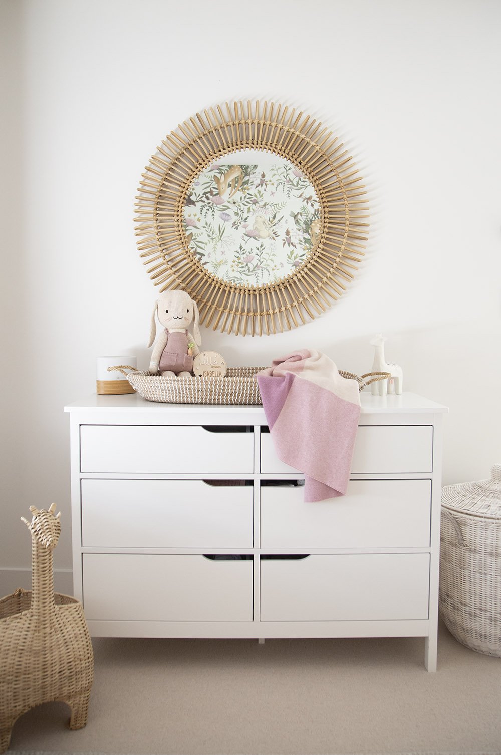
Here’s a close up shot of the dresser with change top basket and mirror. I absolutely love how the wallpaper can be seen through the mirror.
MILES' BOHO MONOCHROME NURSERY REVEAL
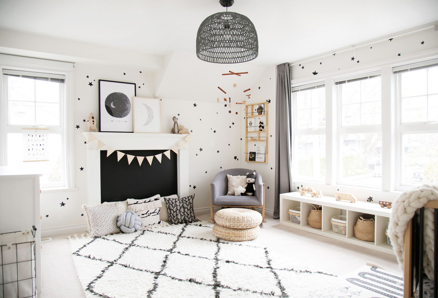
Our latest room reveal is here!!! I am SO excited to share our newest project, little client Miles' monochrome nursery!!!
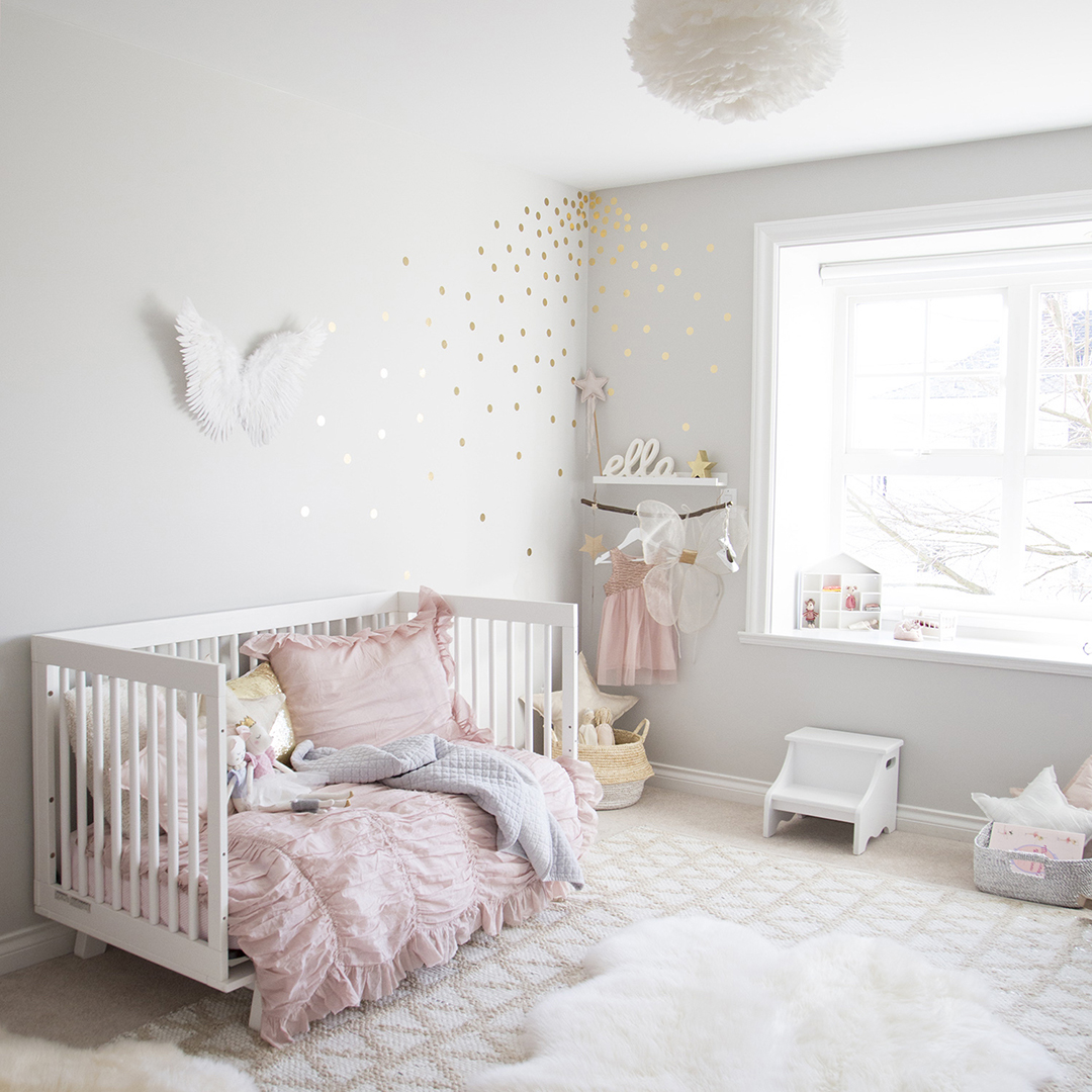
This house may look familiar to you; Miles' baby room is right next door to Ella's toddler room (his older sister) that I shared a couple of years ago.
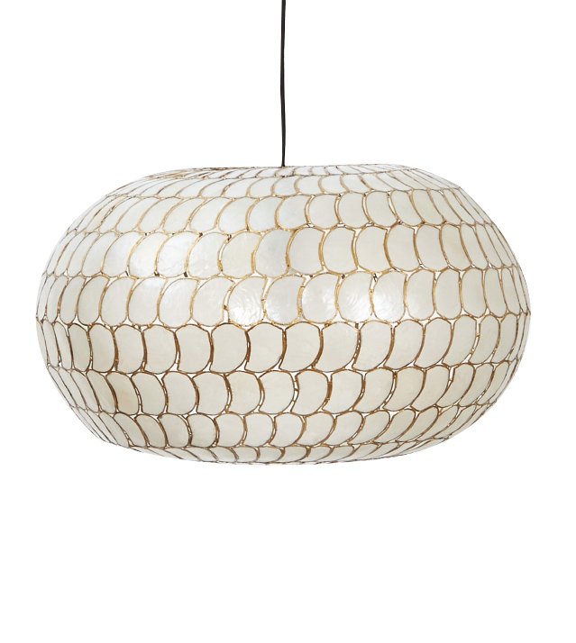
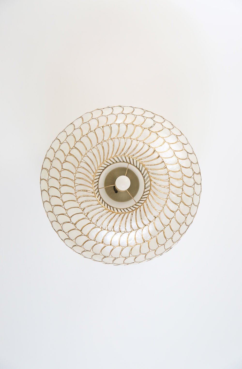
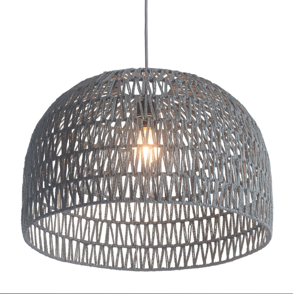
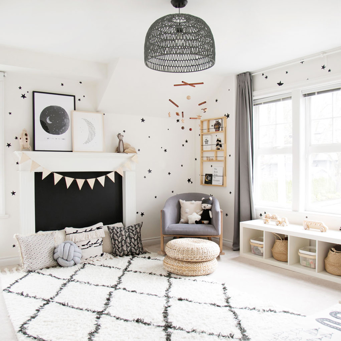
“I love ceiling lights like this one that still let plenty of light shine through. Install a dimmer switch so you can achieve just the right amount of light desired.”
Miles' room is our take on a monochrome boys room. The entire space was based on black and off-white but we wanted to keep the overall feel light and airy with lots of natural wood touches. Stars always feel fitting for a kids room; and this room has nods to space in the 'I love you to the moon' print, the 'dream moon' artwork and the rocket nightlight too. Miles' space is set up to be a dreamy place to sleep but also a perfect place to play.
As Miles started to move, the fireplace became more and more of a point of interest and safety risk. The chalkboard cover (just a piece of plywood painted with chalkboard paint) works perfectly to add such a special detail and covers the fireplace well, keeping little fingers out. I can't wait to hear how much fun he has with this feature when he actually finds out he can draw all over it!
Pillows are perfect for setting up cozy spaces for little ones to relax. I love this knot pillow so much as it not only looks amazing but is lots of fun for babies to grab as well. It functions both as an accessory and toy, which is ideal. Isn't the polar bear adorable too? He's so soft and such a sweet softie to grow up with.
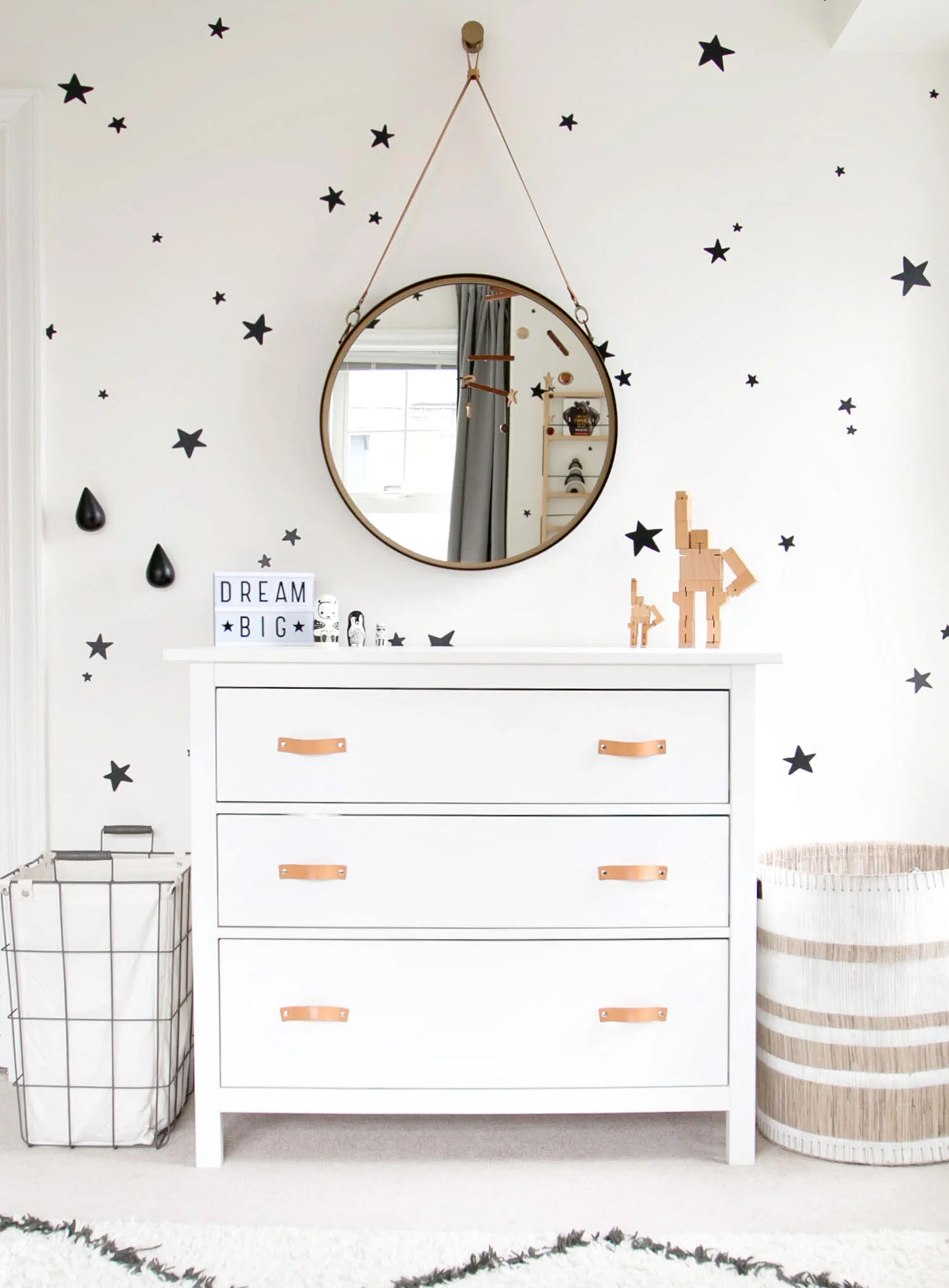
The round mirror over dresser is still one of my favourite set ups for kids. Kids LOVE mirrors and this one will last for so many years to come. I can absolutely see Miles liking this mirror as much as a teenager as his parents do now. Miles' mom didn't want to have a change station as by the stage we designed the nursery, he was wiggling around too much and diaper changes were being done on the floor.
The dresser was an existing IKEA Hemnes one; we simply opted to change the handles to add a special detail that I think adds so much. The leather drawer pulls were found on Etsy.
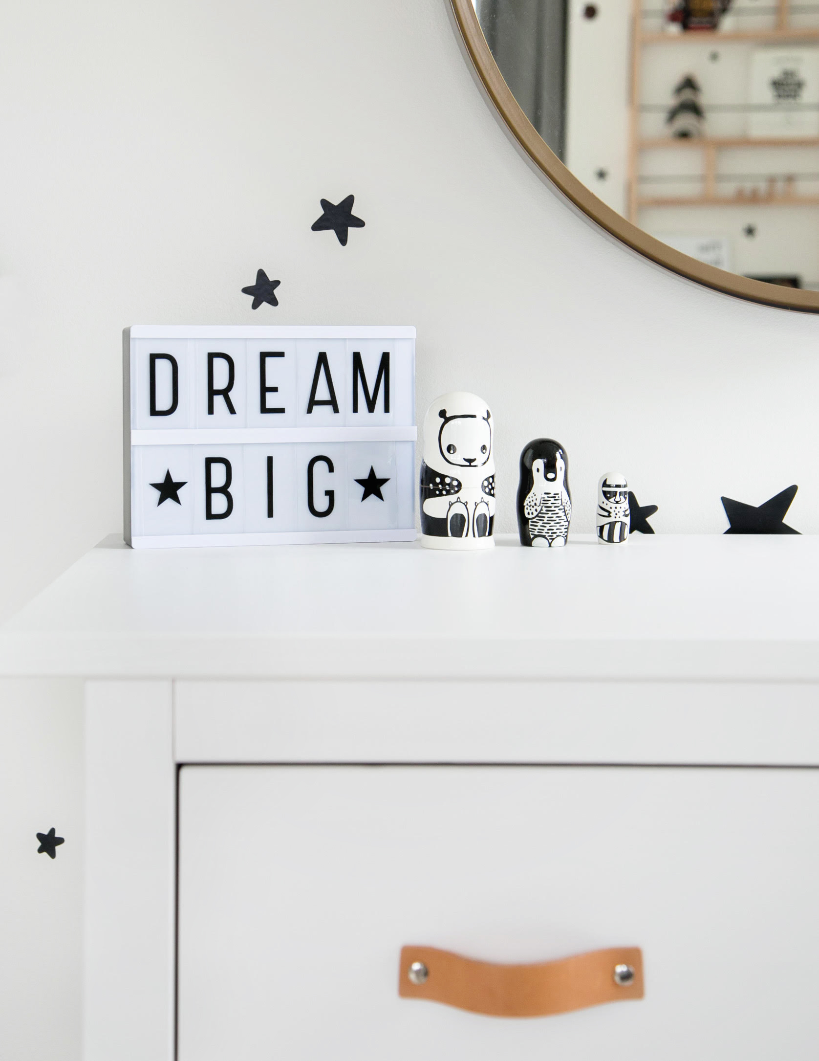
I love how small details like the light box and little nesting dolls add a playful touch when decorating kids rooms. The key is using items that are both educational and decorative so (at least) two functions are covered off in one item.
Use decals as a more affordable way to create the look of wallpaper…perfect for kids rooms as you can easily just peel them off as kids grow!
I don't know what side of this nursery is my favourite but the crib corner is sure up there! It's simple but dreamy and the star decals provide all the magic the wall behind the crib needs.
Right under the window is the best little bench for young ones who are just learning to stand. This bench was originally going to be a window seat but as soon as we put the bench there, Miles LOVED it just as it was!!! This is his favourite place to play, pull out toys on his own and look out the windows!
SHOP THE LOOK…
For those who like to see what the room looked like before, here is a photo of the space when I first arrived. It's always amazing to look back on where we started!
Just like in sister Ella's room, Miles' mama wanted a little shelf with hooks beneath it right by the door. It is such a functional set up for providing a landing place for sweaters, etc. when you walk in the room and helps to keep the space tidy.
Miles sure is one lucky little babe! Rooms like this are such a dream to create and knowing that he will grow up with memories of his time here is the absolute best part.
YOU MIGHT LIKE THESE POSTS TOO...
2018 BABY NURSERY INSPIRATION
Are you expecting? There's so much to get ready for apart from the baby's nursery, take a cue from these gorgeous baby nurseries that are totally on trend for the new year.
We love the use of vintage bassinets for a first baby bed and still can't get enough of THIS CANOPY!
Design by Johanna Bradford
Not sure where to start? Metallic side table, extra sized art, statement wallpaper...YES!
Design by Emily Henderson
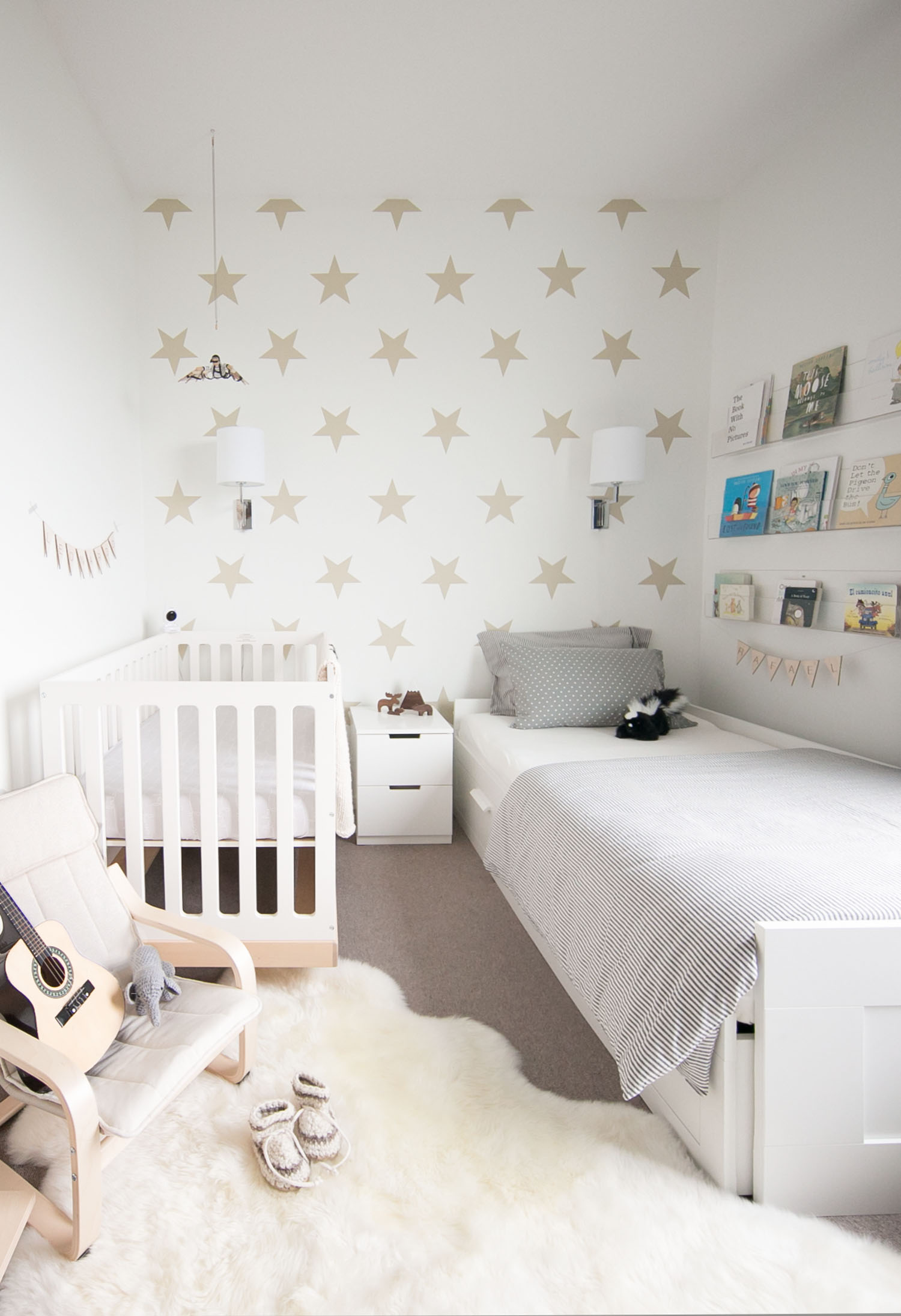
Tight on space? A baby and a toddler can live harmoniously (most of the time!) and I still love how we made it work with THIS MODERN CRIB! A special mobile above the crib is a lovely touch too.
Texture and natural materials will still be going strong through 2018 and this nursery absolutely nails both!
Design by Sharon Montrose
A NEUTRAL NURSERY {& HOW TO STYLE TO SELL}
If you've been following along on my Instagram over the past couple of weeks (and if you don't, come follow!), you'll know that I've been busy decorating a new baby nursery. Well, this project is different than any I've done before as it is set up in a house to sell!!! That's right, this neutral baby room was set up entirely for staging a home.
Other than sharing the nursery reveal, I thought it would be fun to share how the space came together, how my thought process was different for this space given it is set up temporarily and most importantly, how to style your nursery to help with selling your home!
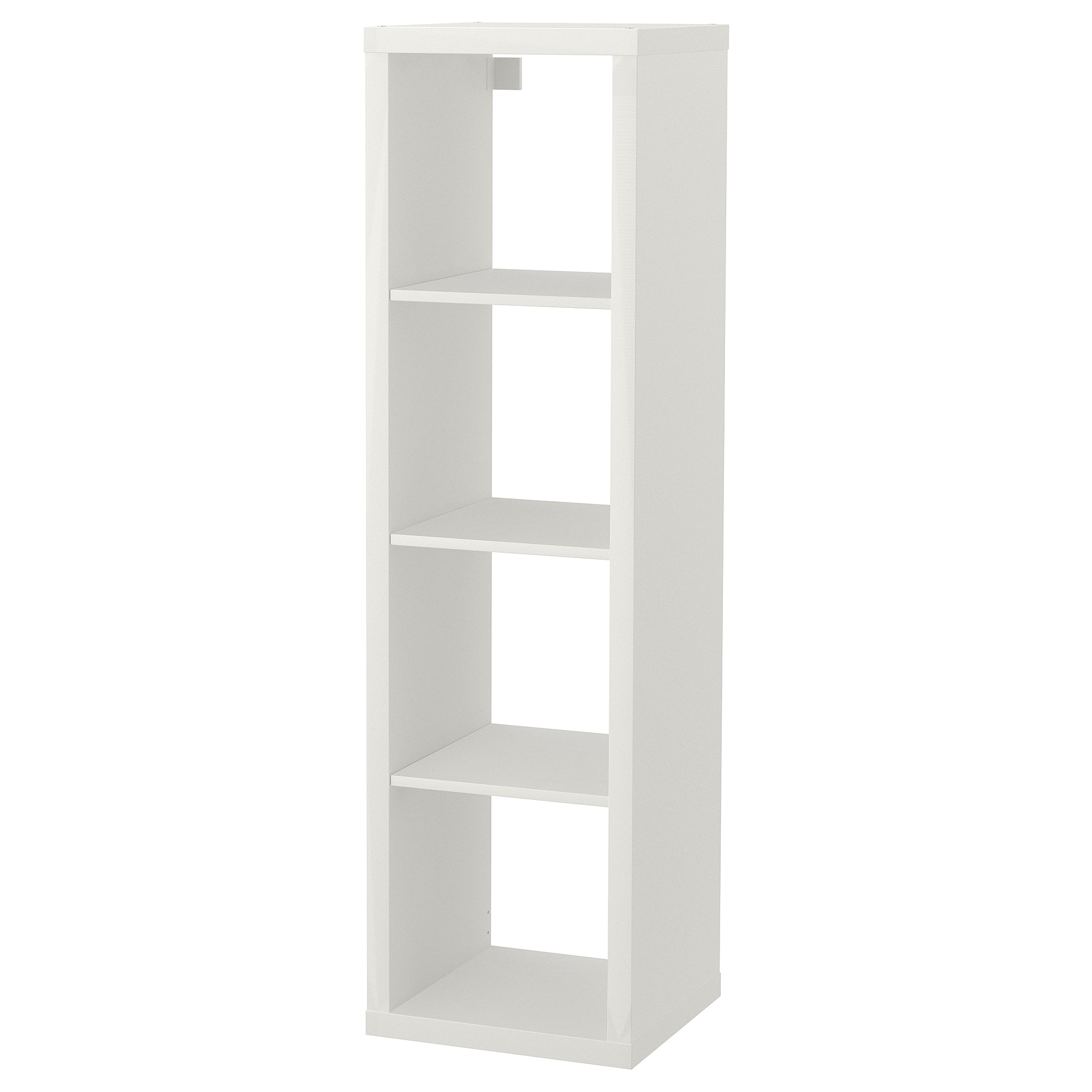
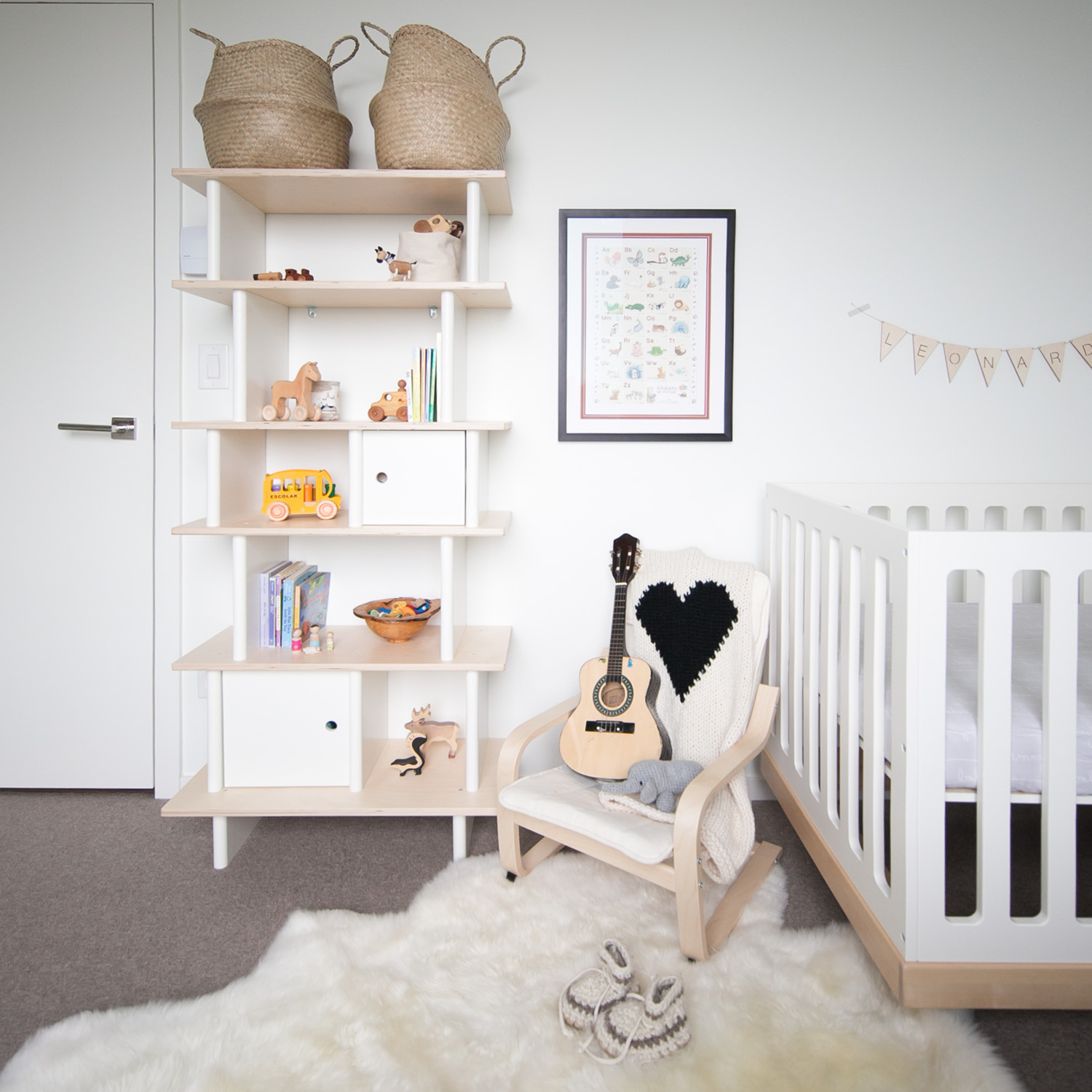
I started with two key pieces of furniture: the crib and the ladder shelf. Given the room is set up so temporarily, I left out a chair although if this space was going to be used with a baby, I would have moved the crib over and added one in.
Here are my key tips for styling your baby's room for sale.
Keep colours neutral:
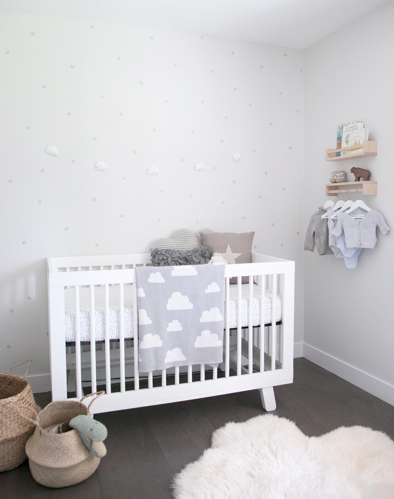
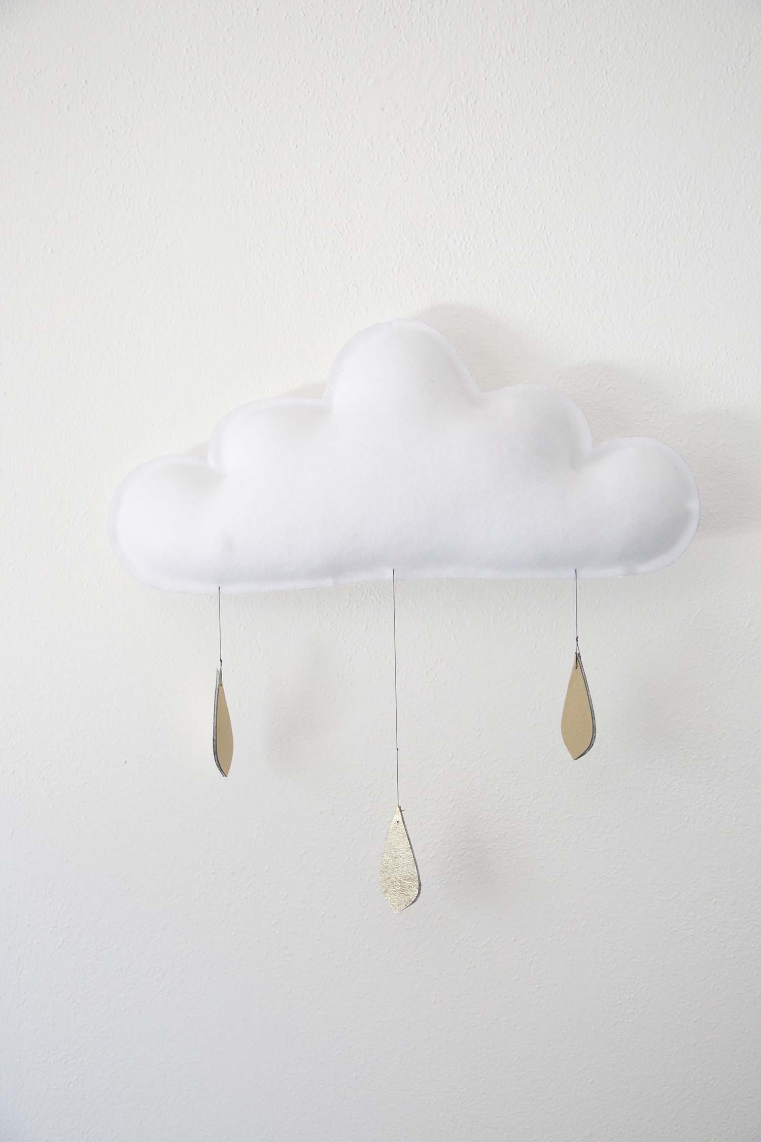
When I saw the room, I knew that a simple white crib would be perfect and this one from Babyletto fit the space well. A white crib works perfectly for either gender and I wanted to keep the space neutral so prospective buyers could envision a baby boy or girl in the room. I just love this cloud mobile from The Butter Flying. This colour palette works equally well if you are setting your nursery up and waiting for the big day for a gender surprise too.
Make the most of the space but leave options:
My goal was to make the small room feel bigger, to highlight how babies only need a few things and to show that by keeping the clothes organization elsewhere (there is a built in storage solution in the closet), you can keep the room tidy and calm. Although this space is quite minimal, this also enables the new owners to see that they could add in some of their own personal touches easily (such as a special photo on the wall or some art). The key here is to keep the paint soft and bright, bring in just enough furniture to give an idea and leave the window coverings open to enhance natural light.
Add in some personal (but not too personal!) touches:
I wanted the prospective owners to feel connected to the space when they walk in. A few sweet baby outfits hanging usually bring the oohs and aahs and adding books and some simple toys could helps parents envision sitting and reading to their baby in this space. These little details also made me dream of snuggling a newborn again!!!
If you love the soft, organic, neutral vibe that this nursery has, you can find all of the details to shop the look below.
01. // White ladder shelf; 02. // Irregular dot decals; 03. // Wooden book shelf; 04. // Mama brown bear; 05. // Babyletto white crib; 06. // Cloud felt garland; 07. // Large soft sheepskin; 08. // Seagrass belly basket; 09. // Linen star pillow.
IF YOU LIKED THIS POST, YOU MIGHT LIKE THESE ONES TOO...
A BABY GIRL'S PINK & DREAMY NURSERY
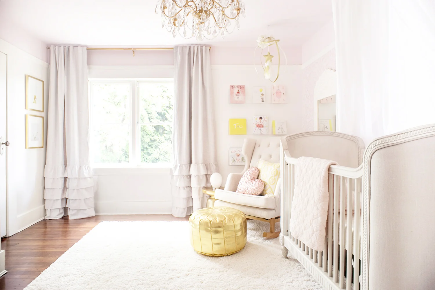
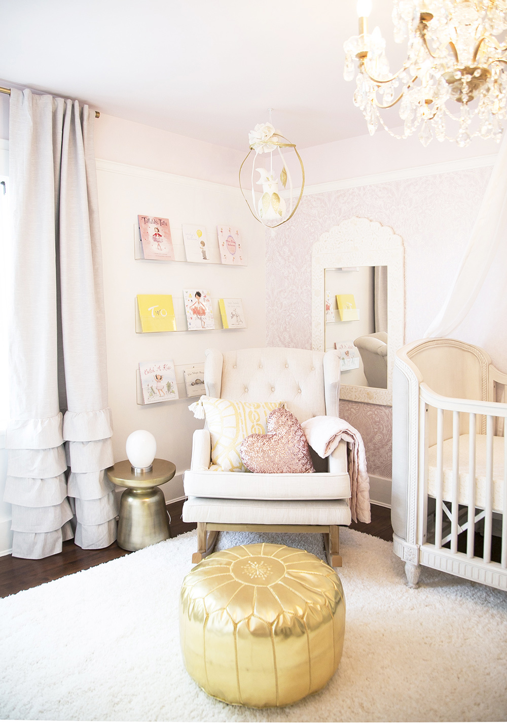
Pink and white with hints of yellow and a splash of gold, this baby girl nursery is light-filled and absolutely dreamy! I can't even begin to tell you how excited I am to share my newest project, little Nayviah's baby room with you all. Baby Nayviah's nursery is finished and it is pure bliss.
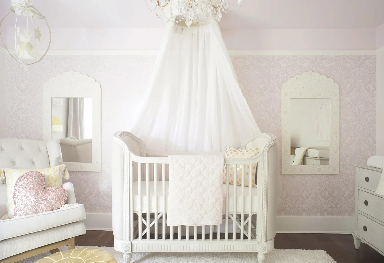
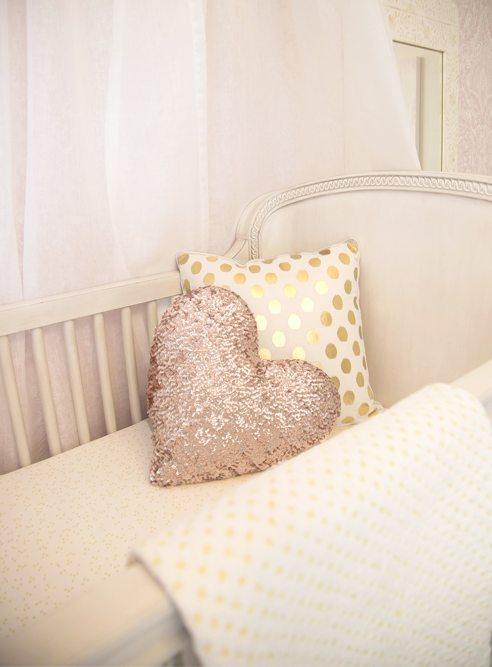
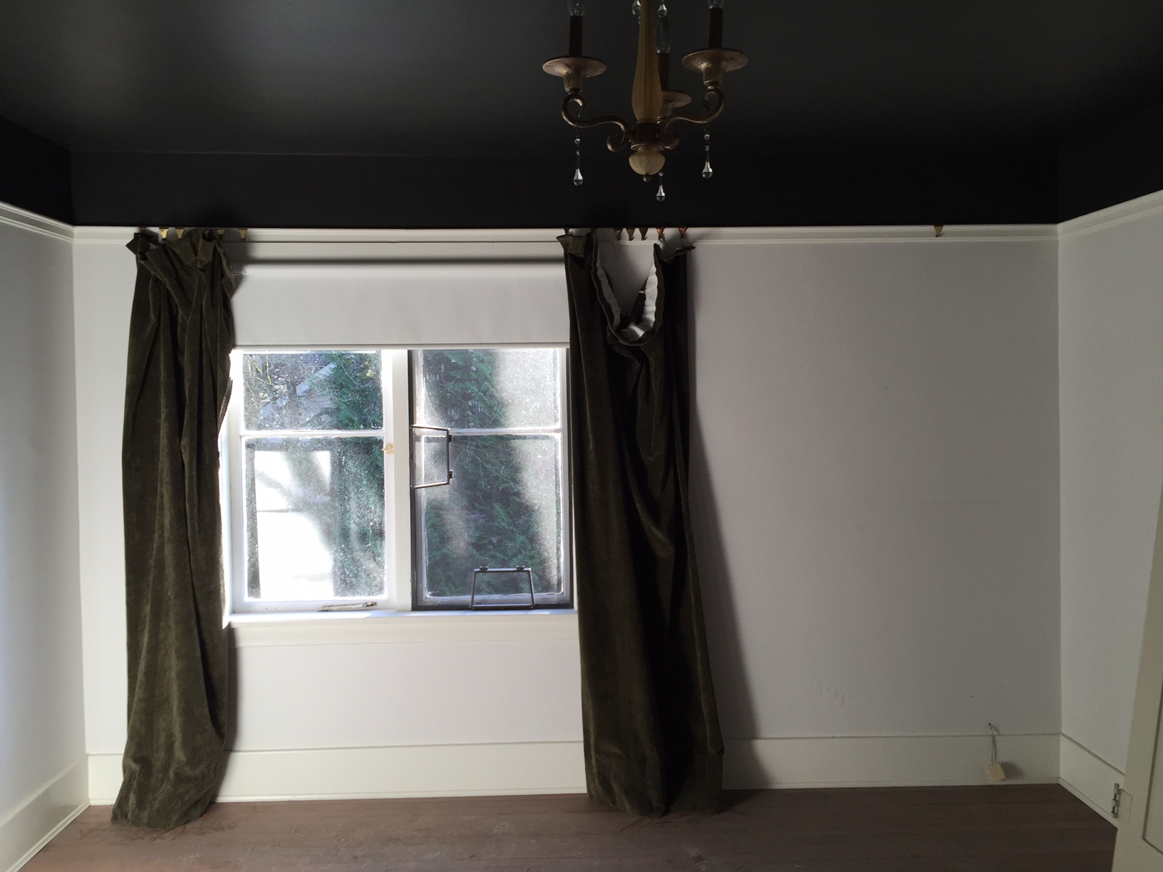
Sweet little Nayviah was not yet here when we were dreaming up and creating the room she would come home to. This room had a black ceiling when I first saw it and right away I knew we wanted to brighten it up and make the most of the gorgeous Vancouver light when it shines. Nayviah's mom had two must-haves on her list: drapery over the crib and damask wallpaper. We worked together to choose the perfect paper and this one really has to be felt and seen up close to get the full effect; there is a shimmer to it that sparkles beautifully when the light shines.
She was a dream client, loving what I presented and seeing my vision right from the start. The room is both airy and bright, soft and serene and the blackout curtains ensure that nap time and bedtime are dark (so important with tiny babes). Working with local artist, Dana Mooney, we created an Ikat on canvas that pulled the yellow, pink, off white and gold together.
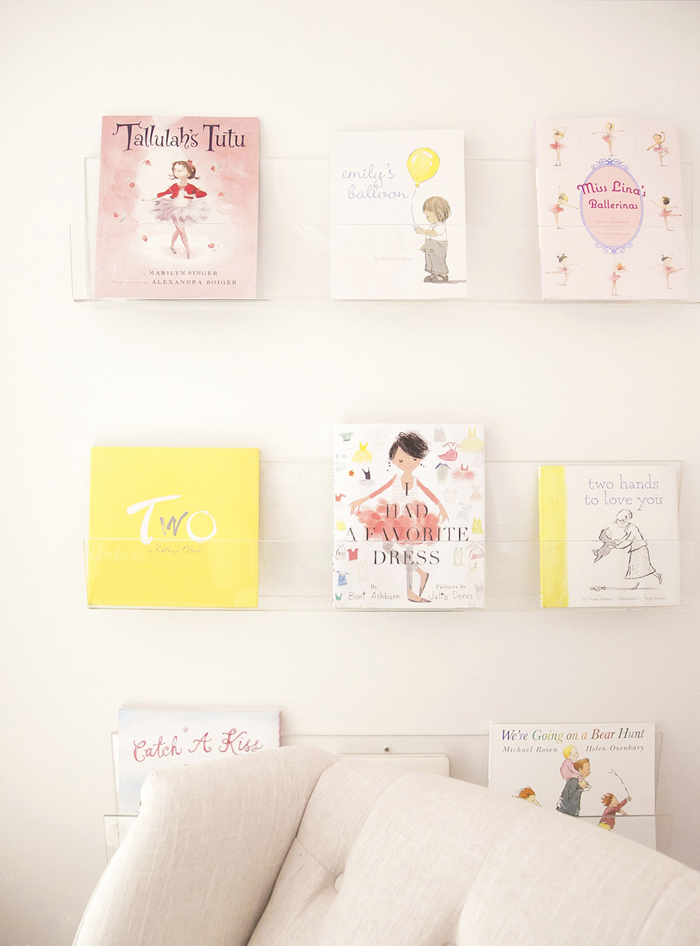
Nayviah has a toddler brother and I wanted to make sure that this space was a retreat for her, a place she could be rocked gently and read to away from the rest of the world. I just love how the book wall turned out with the Ubabub acrylic shelves and she is going to love peering into those mirrors to see her reflection as she grows.
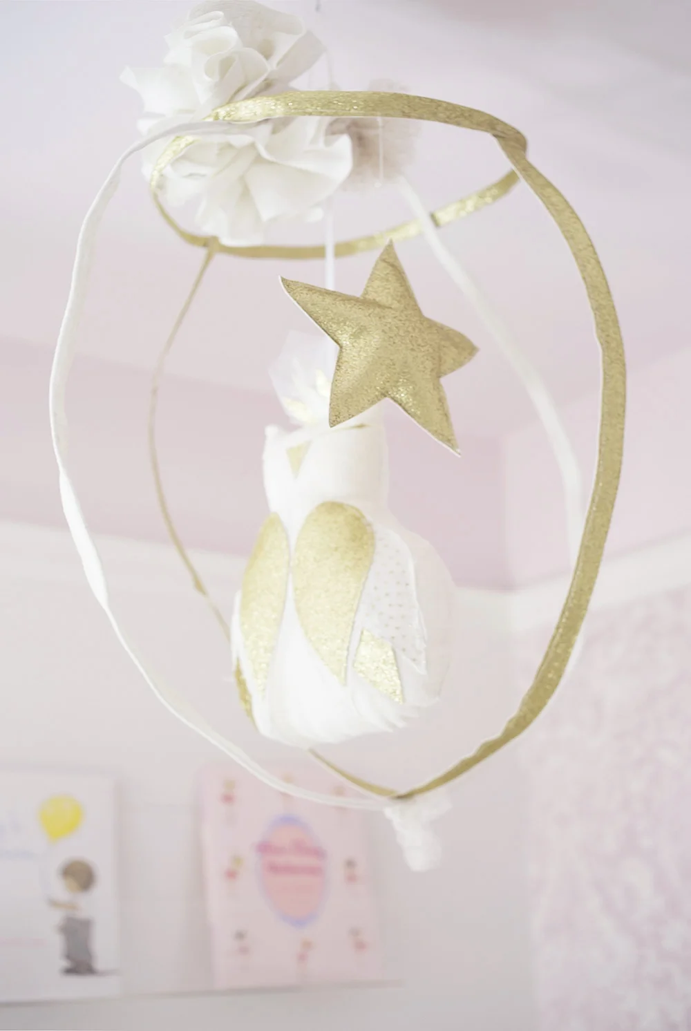
The mobile was custom made and sent from France from the sweetest handmade shop Creme Anglaise, and I have been eyeing it for ages waiting for the perfect space to place her work in. It's hard not to include at least a one of the Animal Print Shop art prints in a space for a little one and I just love how these two pair with the gold ottoman.
I thought it would be fun to throw in a photo of what the space looked like the first time I saw it. It was a newly purchased home and a HUGE renovation happened throughout the house but this room remained intact.
The wallpaper was the inspiration for the whole room and I love how it came together. Just walking in the room now feels completely fresh, airy, bright and serene.
If you liked this reveal...you might like these ones too!
Photography by Rebecca Dadson of Eye Compose Photography.
HELLO!
WINTER DAISY was created when Melissa Barling was laying on the couch while pregnant with twins. She dreamed of a beautiful baby room but couldn't get up and make it happen. The babies were born and in those mid night wakes and early morning feeds, she decided to leave her corporate job to start a design studio + blog. Welcome to WINTER DAISY.
Follow along on Instagram
POPULAR POSTS...
CATEGORIES
- BOOKS WE LOVE
- BOYS ROOMS
- DESIGN TIPS
- DIGITAL
- DIYs
- EFFICIENT MAMA
- FAVOURITE FINDS
- FREE PRINTABLES
- GARDENING WITH KIDS
- GIRLS ROOMS
- GIVEAWAYS
- HELLO
- HOLIDAY
- HOMESCHOOL SPACES
- HOW TO...
- I'M MELISSA
- INSPIRATION
- KID STYLE
- KIDS ROOMS
- MINI GATHERINGS
- MY FAMILY
- NURSERIES
- OH MONDAY!
- ORGANIZATION
- PICKS
- PLAYROOMS
- RECIPES
- RENTAL HOUSE
- RENTAL HOUSE #1
- RENTAL HOUSE #2
- RENTAL HOUSE #3
- REVIEWS
- ROUNDUPS
- SHARED ROOMS
- SHOPPING
- SHOPS WE LOVE
- STYLING
- TODDLER ROOMS
- TRENDS
- gift guide
SUBSCRIBE
Disclosure
WINTER DAISY BLOG contains affiliate links as well as advertising banners. I may receive a small commission on purchases made through links from this site. The content is always reflective of items, things and experiences that I genuinely like and I only work with companies whose aesthetic is in line with the WINTER DAISY brand.
Sponsored posts will always be clearly disclosed.

