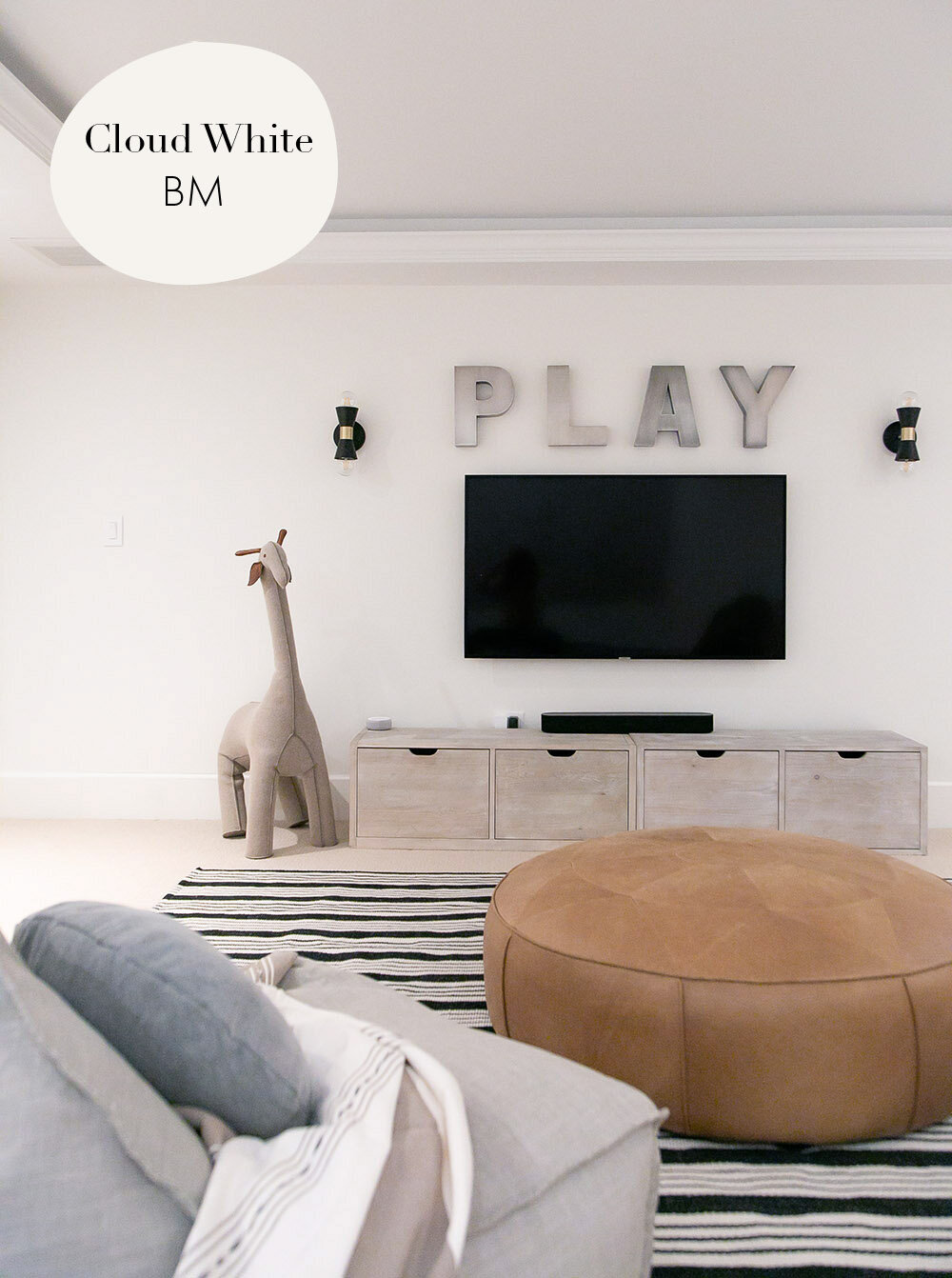
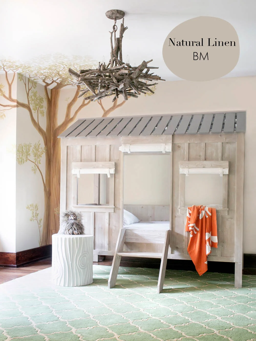
ALL OF THE PAINT COLOURS FROM OUR PROJECTS!

By far, our most asked question is, “what paint colour did you use” in that kids room? No surprise, paint can be tricky!! From the direction the light comes into the room to basement rooms with no natural light, paint is the backdrop for nearly every room you enter.

While it is nearly impossible to tell what exact paint colour was used on quick glance on screen, I thought it would be handy to have a place you can come to for our paint resources; the ones we love and have actually used across our projects.

From the perfect white to a neutral grey and the prettiest pink on a ceiling, here are the colours we’ve used in the nurseries, kids rooms, family spaces and playroom projects you know us for.

BM = Benjamin Moore

YOU MAY LIKE THESE TOO…

THE MAY EDIT: FAVOURITE PICKS OF THE MONTH

April showers have definitely delivered the May flowers and walking around the neighbourhood with the kids as the weather warms up is beyond delightful. As we are spending more time outdoors, I wanted to include some of our favourite things for the backyard in this month’s edit and I am dreaming of a few of these gorgeous swing chairs for reading all summer long.

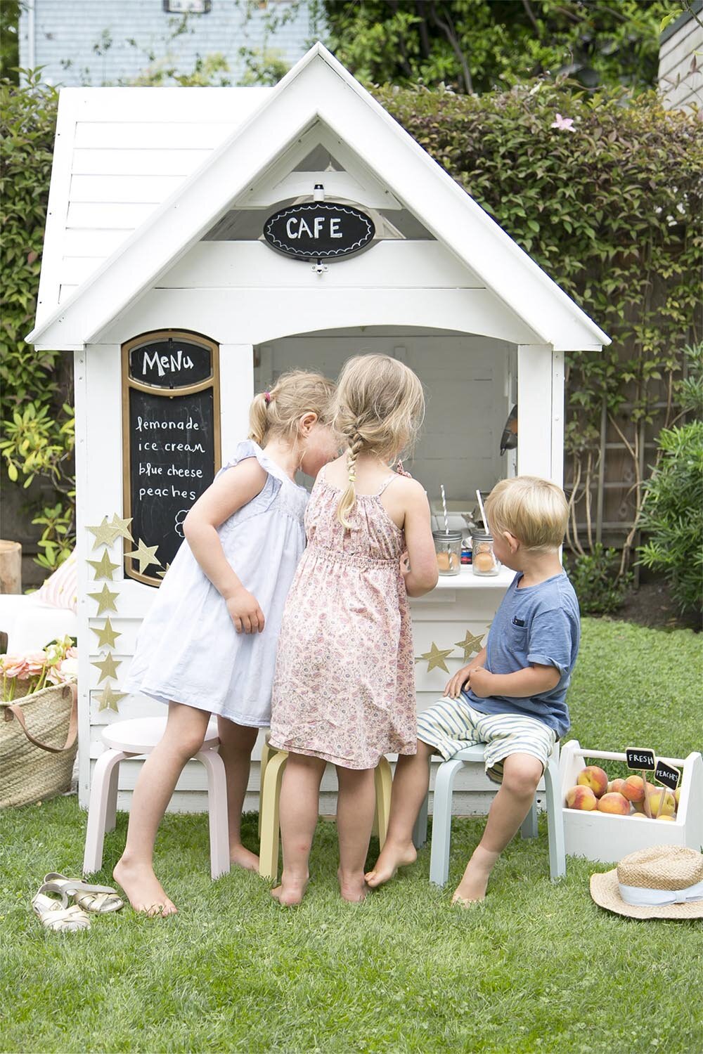
kids playing in outdoor playhouse

The playhouse below is ready for a similar playhouse makeover to the one we did a few years ago and I assure you it was one of our favourite backyard toys ever! You’ll recognize this slide from our modern basement project and I love that the simple bunk bed converts to two twin beds for different stages of your child’s development!

KIDS BATHROOM: WHERE WE ARE STARTING AND THE PLAN

Have you been following our bathroom renovation on Instagram? The kids bathroom in our rental house started out as a completely non-functional space for our family with three kids but we have a plan and I’m sharing it with you below.

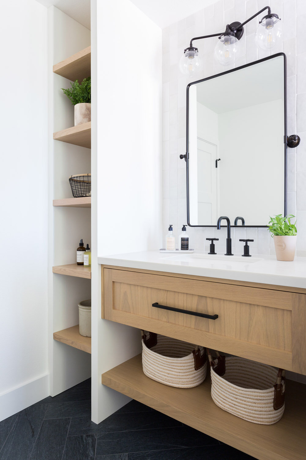
First, let’s start with some gorgeous bathroom inspiration that I used for this project!

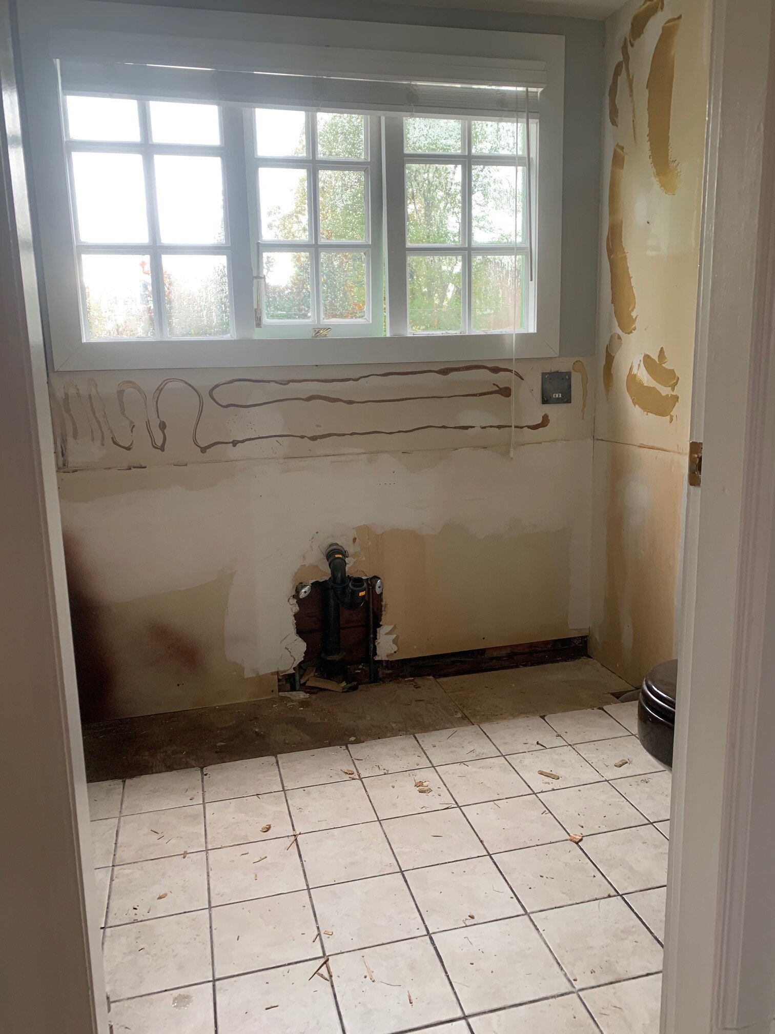
Now, let’s take a step back and see where we started. This is the bathroom when we rented the house.

rental house #3 bathroom before

It really started out as such a non-functional space and likely the only reason that our family was lucky enough to rent this house; I said that as part of the rental, I would update the bathrooms! There was a decent amount of space here, but I truly have no idea how the previous owners functioned with it.

Let me break down the issues:

  • the door opens into the bathtub

  • the toilet and bathtub are brown!

  • the vanity is far too large for the space

  • the glass doors on the bathtub close off the space

  • the entry door opens into a person standing at the vanity, or getting out of the tub!

  • the tile is dirty and would be great to replace

Over the past week, I’ve been sharing the step-by-step process on Instagram stories, so let me update you in here in case you’ve missed out.

The entry door has been removed, the glass doors to the shower have been removed, the vanity and mirrors have been removed (photo on left) and the tile has been stripped out!

bathroom with vanity removed
tub surround stripped

It’s amazing to see how far we’ve come already! I feel like you can actually see the space properly now and I can’t wait to start getting some of the new pieces in place.

So, what’s the plan? Well, one thing I won’t do in a rental is remove a bathtub (unless doing it with the owner) for fear of water damage. In this case, the tub is actually in pretty good shape and we will be having it refinished (a VERY cost effective way to refresh a tub). New tile will replace the old (our biggest cost) and yes, we will be replacing the brown toilet with a white one!

After perusing bathrooms online, I decided to really keep the colours simple and this was truly determined to find a very low cost tile for the floor and walls. Since using a professional to tile the bathroom would be our highest cost, I wanted to keep the cost of the actual tile to a minimum, as this is a rental after all.

You can imagine that white was a clear choice, and yes, the tub and walls will be white but I wanted to add something playful since this is the kids’ main bathroom and so we went for a bold patterned tile in black and white! I chose to add warmth through the vanity and you can see how the simple colours of black, white and wood go together in the board below.

modern kids bathroom decor

FREE PRINTABLE: EARTH DAY!

Did you know that Earth Day is next week, Thursday April 22nd? We love to celebrate Earth Day with our kids and wanted to offer a fun way for you to acknowledge the day too! We usually pull out some of our favourite books about our beautiful earth, talk about how we can take care of it and this year, together with Lana from Lana’s Shop (go check out her gorgeous watercolour illustrations!), we’ve created a word search for you & your kids to enjoy! Get the free printable below.

earth day free printable

SHOP THIS POST…

earth day free printable word search
Earth Day word search
completing the word search for earth day

DOWNLOAD THE EARTH DAY PRINTABLE HERE:

earth quote.jpg

INTRODUCING: RENTAL HOUSE #3!

Say hello to our new home (for now). At some point we’ll own OUR VERY OWN home, but here I am introducing you to rental house #3!

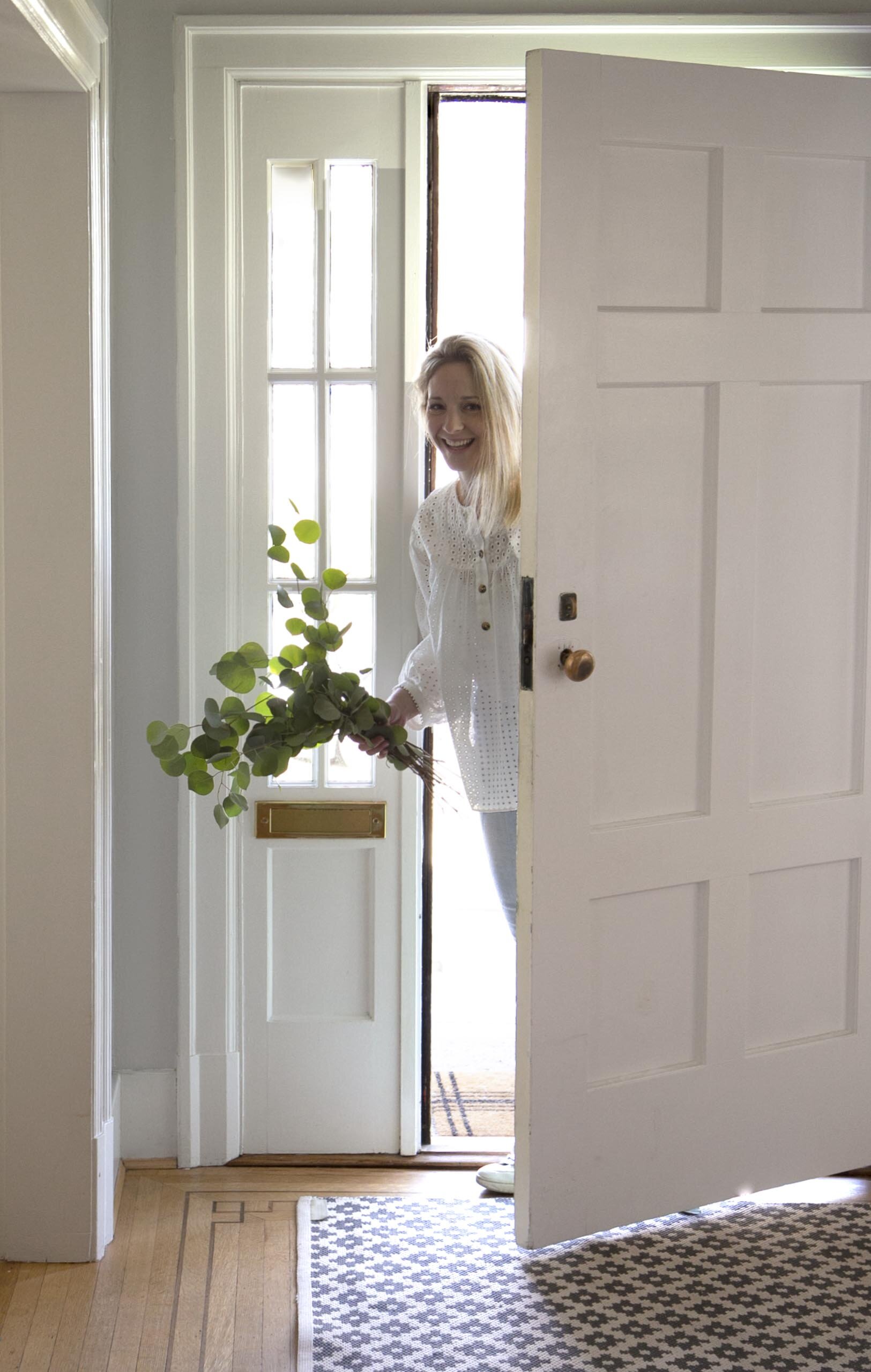
Melissa Barling walking into rental house #3

Let’s rewind a bit and start at the beginning. Here’s the story: while we were on the hunt for a house to buy in the Spring of 2020, I stumbled across this gorgeous home and although it was out of our price range (sigh…the Vancouver market), it was the kind of home I could imagine raising a family in. There’s a big back yard and a deck off of the kitchen (indoor / outdoor living please!), 4 bedrooms upstairs and truly, THAT is a near impossible find in this city.

Fast forward a few months and Covid restrictions meant that more and more people were working from home (and I was full-time homeschooling our 3 kids). I had completely forgotten about this house. I read an article saying that lots of families were moving out of the city and that was driving rental houses down in price. I quickly hopped online and did a brief search. Very surprisingly, I spotted this house straight away: the new owners had listed it for rent! Maybe it was meant to be.

While the timing seemed a bit off (I’d just finished refreshing our last rental house), this presented the opportunity for the kids to have their own rooms and all of us to have more indoor and outdoor space and with SO much more time spent at home than usual, we decided to go for it! I think in reality, we were all ready for something new to look at after a year of being inside the same space together. Imagine that?! ;)

So, come on in…let me give you a quick tour of a few spaces I’ll be sharing here on the blog!

THE BATHROOM:

This is the first major space that needs updating. I know some people think that we’re crazy updating bathrooms in our rental houses, but it is the most important room (in my opinion) to know is clean, so it’s worth it to me!

bathroom before

Aesthetics aside, can you see that the bathroom is barely functional with the door opening directly into the tub and shower? Yikes! I believe this is the reason that we ended up taking this house (knowing I could change this) and others might not have been so keen.

KIDS ROOMS:

The kids each have their own in this house!!! This is one of the main reasons we were interested in moving. Our twins (now 10 years old) have shared a room since birth and were starting to ask for more of their own space. Our youngest, 8 years old has been lucky to have his own room the whole way along and of course always wishes he shared. The rooms are all a good size and each has its’ own closet. Check.

Kids Room #1 - Noelle’s Room

kids room #1 before

Kids Room #2 - Kaia’s Room

kids room #3 before

Kids Room #3 - Xavier’s Room (we brought his light from the last room!)

Xavier’s room won't be much of a change from the last house, but I still think it would be helpful to show you how we can buy furniture for one home and use it in the next. Quality furniture lasts and looks great everywhere!

kids room #2 before

LIVING ROOM:

Good bones, good size, good light and a fireplace mantel, which means we can hang stockings at Christmas! This room feels easy to freshen up and worthy of many family game nights.

living room before

View from fireplace wall (below).

living room to entry before

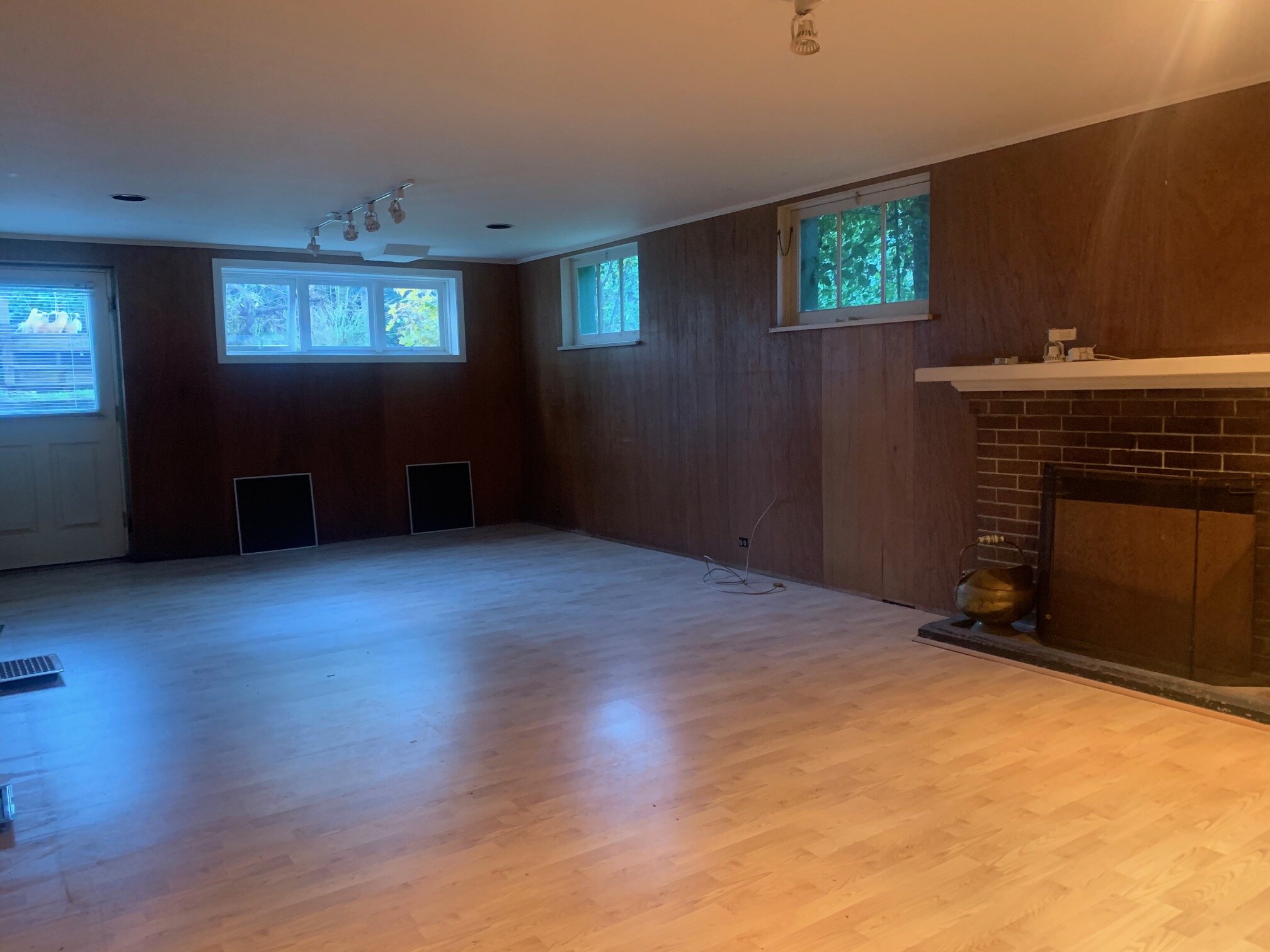
BASEMENT:

It’s a good thing we’ve been designing lots of basement playrooms because I will finally get to design somewhere fun to play for my own kids! I’m thinking TV lounge area and art space.

basement before

For those of you that have read this far, thank you for being interested in our new home! I can’t wait to share the updates alongside our kids’ room designs as we freshen up and decorate this rental house to create a new home for our family.