KIDS CHRISTMAS WOODEN PLAYHOUSE
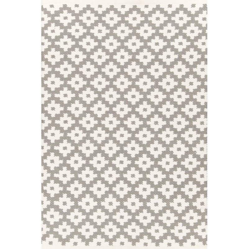
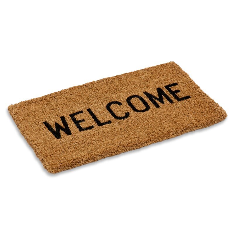
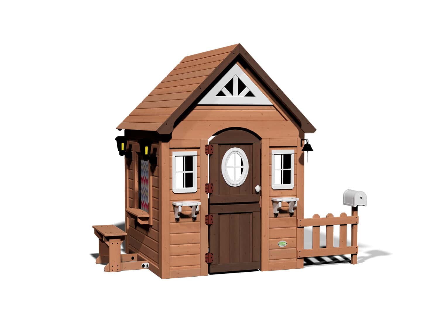
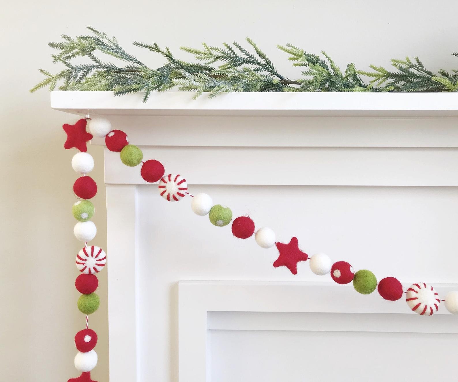
GET THE LOOK…
Our little wooden playhouse is all decorated for Christmas!!! You may remember the summer makeover of this cubby house from last year and I finally got a few things together to decorate it for the holidays. I had this idea to surprise the kids with a fun afternoon outside eating shortbread cookies and drinking hot cocoa and I am so thankful we did it before the crazy rain started because they LOVED it!
The white lit birch trees were such a fun addition that I will move inside later; one for the girls' room and one for Xavier's.
We swapped summer lemonade for hot cocoa and the menu changed to include cookies, brownies and candy canes (kids dream menu!). All three kids wanted to take turns 'serving' the others and the shortbread cookies were gobbled up nearly instantly.
I just love the unexpected colours in the peppermint garland from Pearl and Jane. It's so cute for the playhouse and would be equally as adorable as holiday decoration in a children's room!
I adore the little details in our playhouse: the tiny HO HO HO banner, gold drop garland and JOY banner are all from Etsy. So many creative makers that I love to support! I just had to include this photo of our youngest smiling broadly and poking over the door.
If you missed the original makeover, you can find that post here. I hope you find inspiration and a little fun from our holiday playhouse.
YOU MAY LIKE THESE POSTS TOO...
A NEUTRAL NURSERY {& HOW TO STYLE TO SELL}
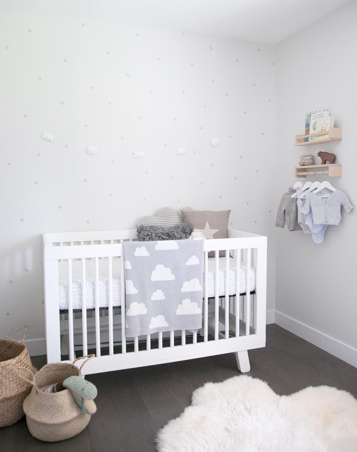
If you've been following along on my Instagram over the past couple of weeks (and if you don't, come follow!), you'll know that I've been busy decorating a new baby nursery. Well, this project is different than any I've done before as it is set up in a house to sell!!! That's right, this neutral baby room was set up entirely for staging a home.
Other than sharing the nursery reveal, I thought it would be fun to share how the space came together, how my thought process was different for this space given it is set up temporarily and most importantly, how to style your nursery to help with selling your home!
I started with two key pieces of furniture: the crib and the ladder shelf. Given the room is set up so temporarily, I left out a chair although if this space was going to be used with a baby, I would have moved the crib over and added one in.
Here are my key tips for styling your baby's room for sale.
Keep colours neutral:
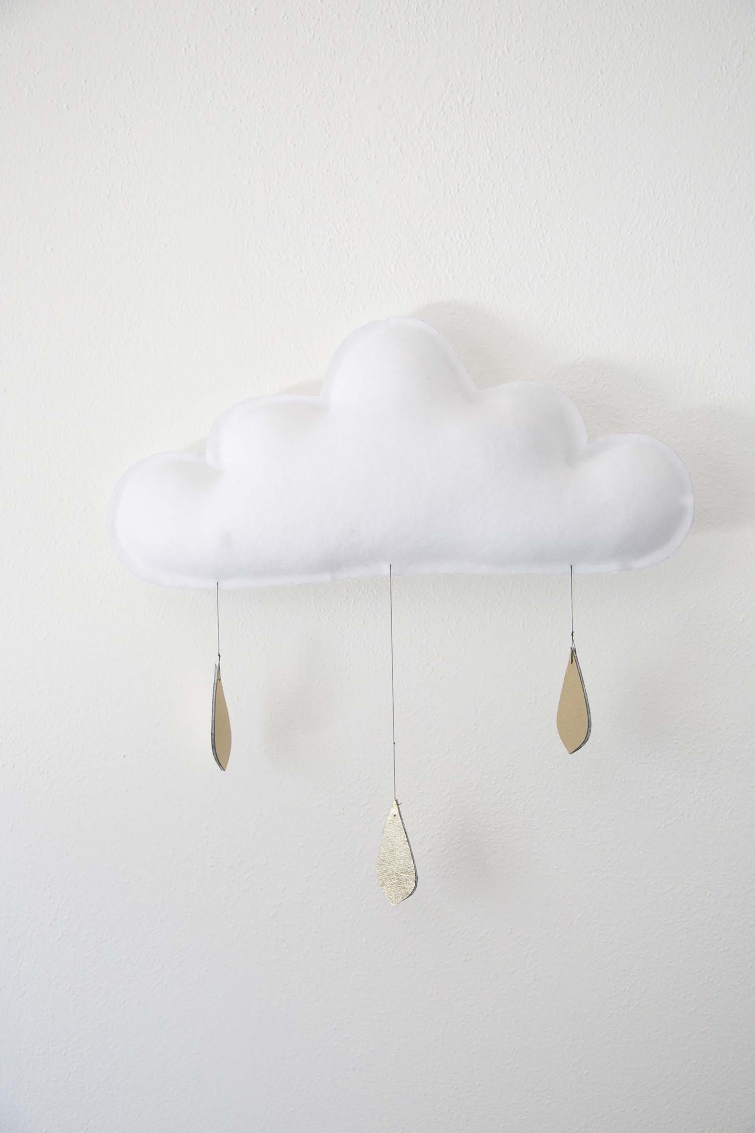
When I saw the room, I knew that a simple white crib would be perfect and this one from Babyletto fit the space well. A white crib works perfectly for either gender and I wanted to keep the space neutral so prospective buyers could envision a baby boy or girl in the room. I just love this cloud mobile from The Butter Flying. This colour palette works equally well if you are setting your nursery up and waiting for the big day for a gender surprise too.
Make the most of the space but leave options:
My goal was to make the small room feel bigger, to highlight how babies only need a few things and to show that by keeping the clothes organization elsewhere (there is a built in storage solution in the closet), you can keep the room tidy and calm. Although this space is quite minimal, this also enables the new owners to see that they could add in some of their own personal touches easily (such as a special photo on the wall or some art). The key here is to keep the paint soft and bright, bring in just enough furniture to give an idea and leave the window coverings open to enhance natural light.
Add in some personal (but not too personal!) touches:
I wanted the prospective owners to feel connected to the space when they walk in. A few sweet baby outfits hanging usually bring the oohs and aahs and adding books and some simple toys could helps parents envision sitting and reading to their baby in this space. These little details also made me dream of snuggling a newborn again!!!
If you love the soft, organic, neutral vibe that this nursery has, you can find all of the details to shop the look below.
01. // White ladder shelf; 02. // Irregular dot decals; 03. // Wooden book shelf; 04. // Mama brown bear; 05. // Babyletto white crib; 06. // Cloud felt garland; 07. // Large soft sheepskin; 08. // Seagrass belly basket; 09. // Linen star pillow.
IF YOU LIKED THIS POST, YOU MIGHT LIKE THESE ONES TOO...
ELLA'S BIG GIRL ROOM
If you've been following along for a while now, you'll remember Ella's soft pink and gold toddler room from last spring! I am excited to share an update of Ella's room, with the main change being her big girl bed. I wanted to show you how little has really changed in the room, and that creating the right space when your little one is a baby or toddler really can last for years to come, with very minor changes.
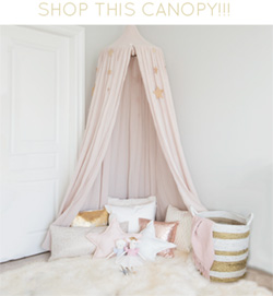
Ella's canopy was originally used to create a corner for her to read and play in (below left). As toddlers grow, it's fun to make changes to inspire and invite play; this is as simple as putting the canopy over her bed for now and it can easily be changed back on a whim. The little dollhouse was added as a fun place to play right at Ella's height.
The other side of the room hasn't changed at all, with the dresser still working well and the dress up corner still being used.
I still get so many questions about where to find items from Ella's room, so I thought I would link as many of possible for you here. If there is something I've missed, or if you have any other questions or comments, I'd love to hear them below!
01.// Wire daybed; 02.// Duvet cover; 03.// Gold mirror; 04.// Angel wings; 05.// Ella pillow; 06.// Wood dollhouse; 07.// Gold decals; 08.// Step stool; 09.// Star cushion; 10.// Powder canopy; 11.// Toy basket; 12. // White dresser (similar).
RAFA + LEO'S SHARED BABY & TODDLER ROOM
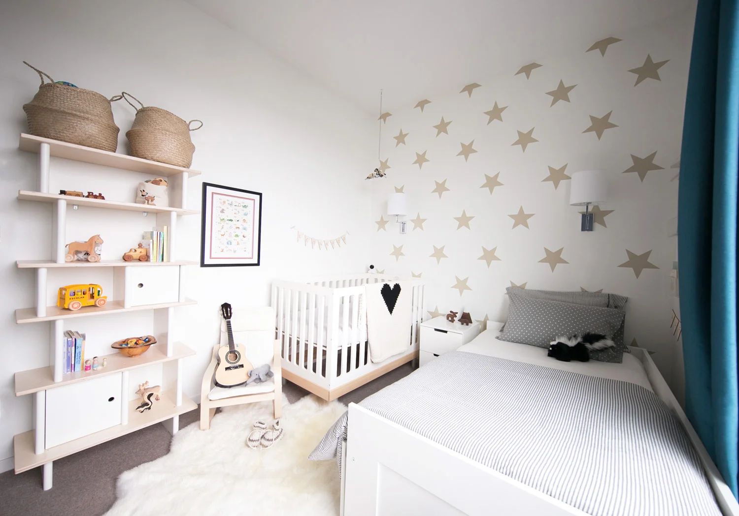
I am ridiculously excited to share our newest little clients' room, Rafael and Leonardo's shared baby and toddler boy room!!! Their gorgeous Mama contacted me when she was pregnant with her second baby in the hopes that we could maximize the space of her son's existing room to include the new baby. Although the room is small, I was confident that we could make it work and include the necessities for a new little one as well as the growing needs of her toddler son.
As part of our initial consultation, we discussed how the family wanted this space to feel. The words used were, "uncluttered and calm". There were A LOT of toys, clothes and items that had been collected over the years since Rafa, the 2 year old, was born and in order to make sure this space could really feel uncluttered, we needed to ensure that the toys could be stored somewhere where they could easily be played with and also tucked away for bedtime.
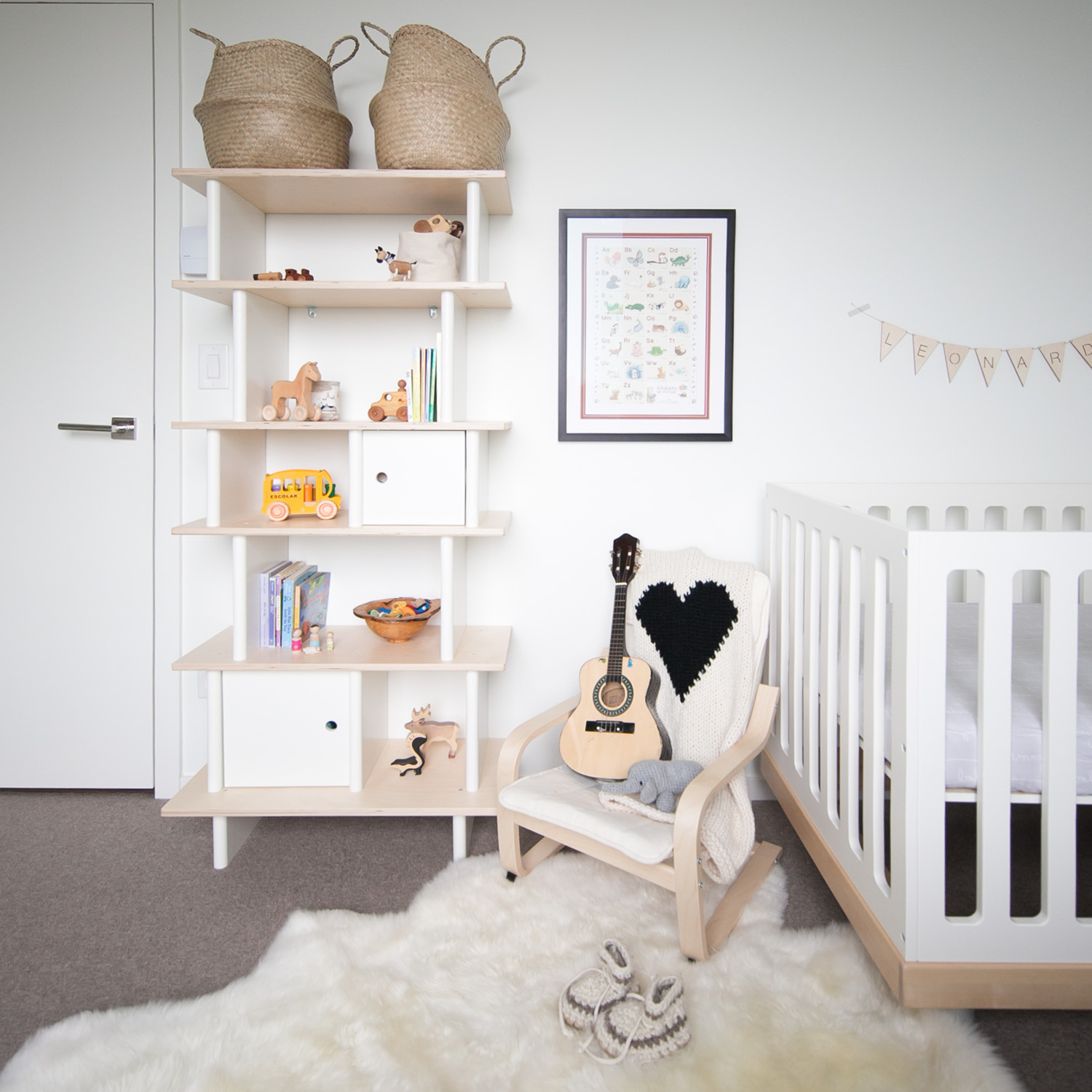
The beautiful Oeuf classic crib was the only piece of furniture that they wanted to keep from the old room and I have been dying to use this Oeuf vertical shelf since it came onto the market, so this presented the perfect chance!
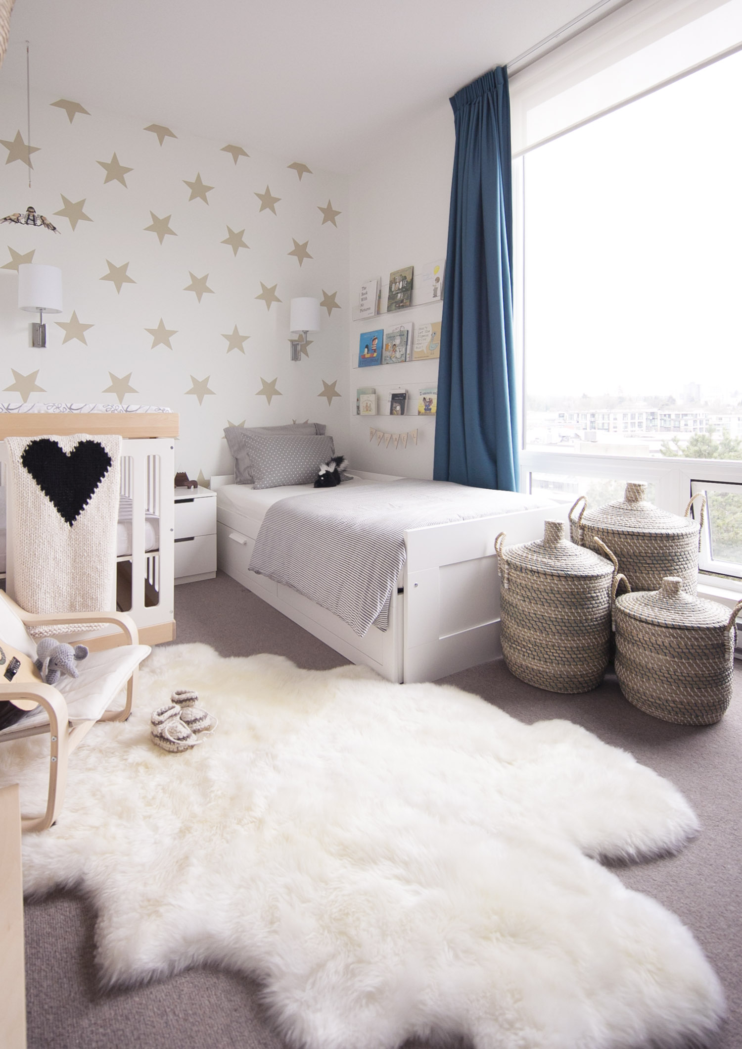
We played with different layouts until we came up with this one where the twin bed would cover a bit of the window. We wanted to maximize the floor space in the room to make sure the boys had a little play area. The key to making this work is that the bed is low to the ground as well as void of a footboard, so that the furniture really doesn't get in the way of the window at all.
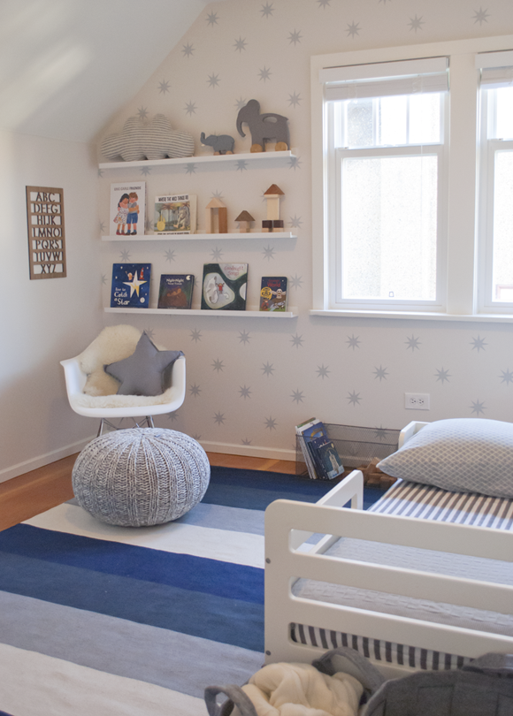
I love how the beige star wall decals transform the main wall and give the effect of wallpaper (but have the ability to be easily removed).
The incredible baby mobile below was a find that Rafa and Leo's grandfather picked up on his travels in Greece and brought back for the room (seriously cool Grandfather I'd say!).
One of the things that we have to consider when designing baby and kids rooms here in Vancouver is ensuring that the room is 'earthquake safe'. It's not something any of us like to think or talk about but I love that this tall wall shelf can so easily be secured to the wall. Safe not only for that but also for little toddlers that like to pull and tug on things.
The boys' Mom and Dad love to go to local markets around Vancouver on the weekends and many of the beautiful accessories and toys on the shelf and around the kids' room are handmade by local companies, including this alphabet poster. It's so much fun to be able to use such special pieces in this space.
Rafael is currently obsessed with little finger puppets so we popped these into a bowl that he can easily access on one of the lower shelves. I love how easy it is to move toys around and rotate new ones on the shelves that he can reach.
Although he is only 2, Rafa is growing up in a musical family and adores playing different instruments. He loves this little guitar. Other instruments are in one of the baskets on top of the shelves so that they can easily be brought down when baby brother Leo is awake and easily put away during nap times.
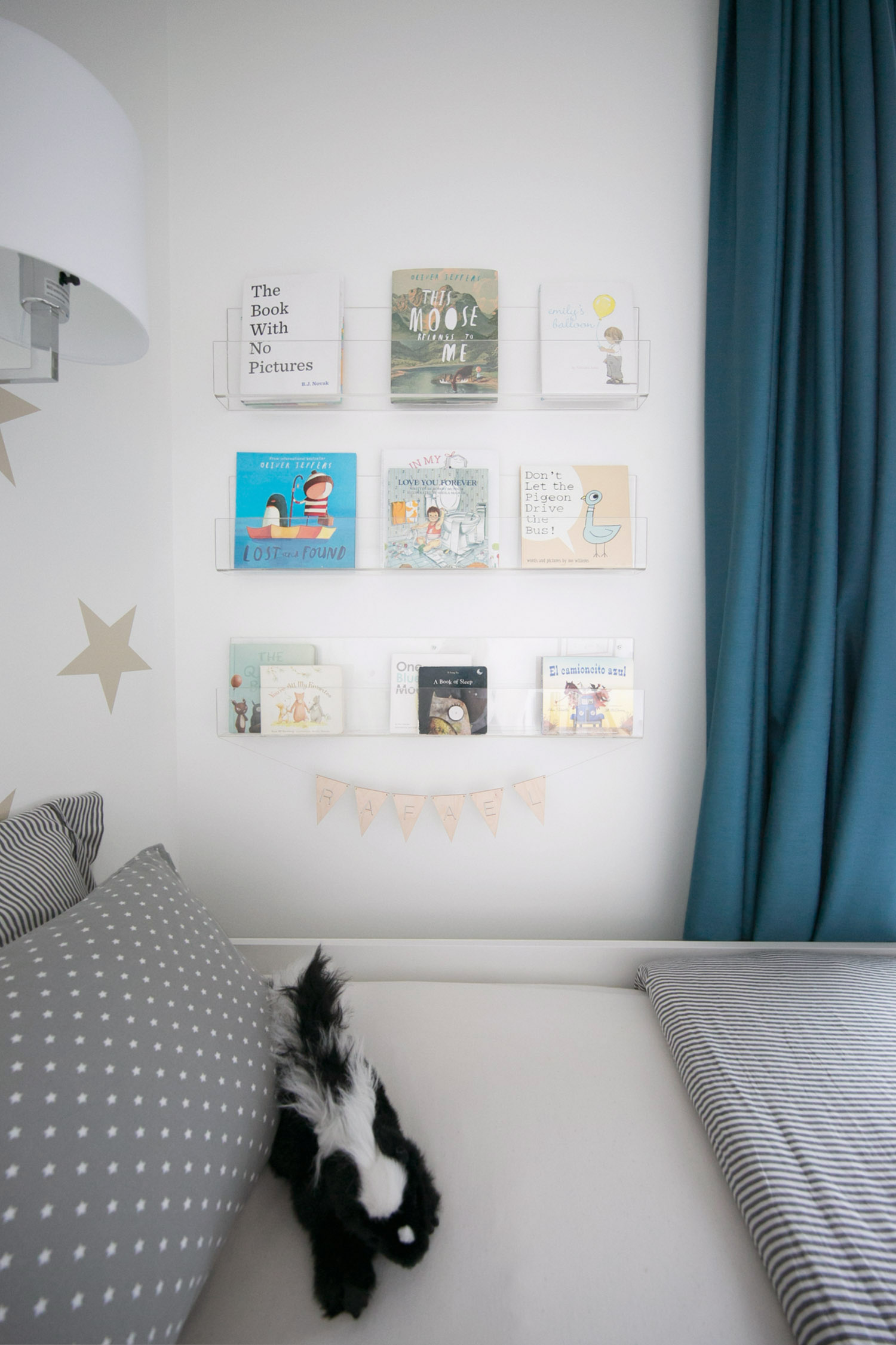
You've seen me use these clear bookshelves in a previous baby nursery but I couldn't resist using them here too. In this case, as we were putting the shelves above the bed, I wanted to ensure the books were on shelves that they couldn't easily fall off of. I really do adore how these shelves allow the books to be featured as art.
As I mentioned earlier, so many sweet accessories by local companies were brought into this space, such as the gorgeous heart blanket from Yarning Made and the darling wooden animals from Trae Designs. You can find this sweet name banner from Sprig West and the custom growth ruler on Etsy.
On the other side of the room you can see that we decided to turn the closet doors into a playful chalk board!!! I LOVE how these turned out and especially how Rafa and Leo's Mom decorated them for shoot day; just too cute. I imagine hours of fun here where Rafa draws pictures for his brother and one day baby Leo will be able to join in.
Have I told you that this is my dream job? This room was so much fun to create and I hope the result shows that. This is the room that so many adventures will happen in, sibling giggles, stories read, music played. I literally love creating spaces for little ones to make memories in.
IF YOU LIKED THIS ROOM, YOU MAY LIKE THESE TOO:
BABY & TODDLER SHARED ROOM (A SNEAK PEEK!)
Last September I started working with a new client who was pregnant with her second baby, the first little one was a 2-year-old toddler boy. At the time, my client was feeling like the amount of stuff creeping into their lives from having a growing toddler was becoming overwhelming and she really wanted to get this sorted before welcoming the new baby. The brief was essentially to transform the existing nursery (photos below) into a big boy and baby shared room that was calm and uncluttered with enough floor space for the kids to play (design board above). The space was tight but I could absolutely see how we could make this little room fit what the family wanted!
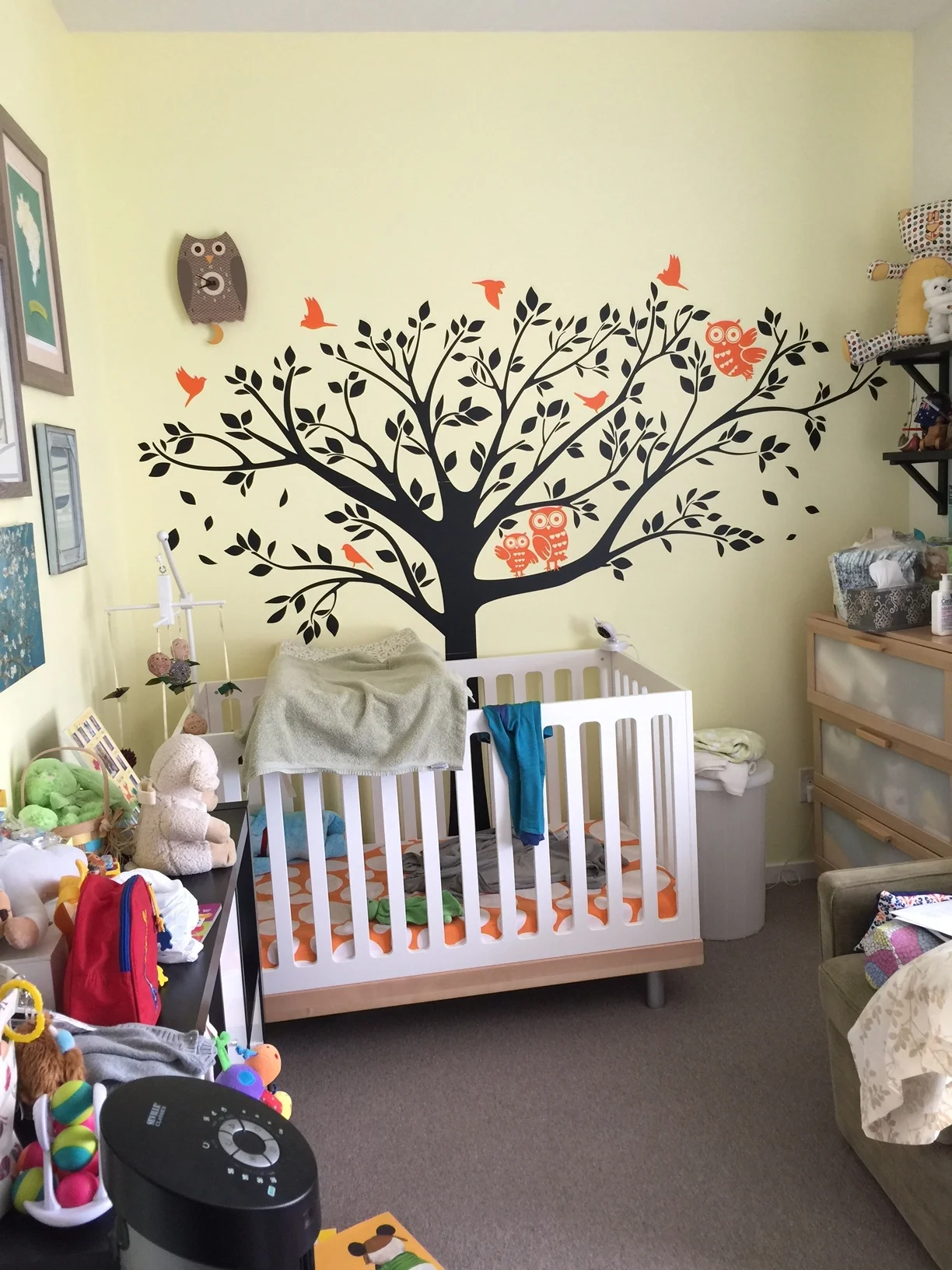
The nursery as originally photographed:
Design wise, they wanted the space to feel bright and happy, using natural materials and keeping the room within a neutral colour scheme as they were leaving the gender of the baby a surprise until delivery. Functionally, they wanted access to both beds, some dim lighting for night time, access to toys and a play area on the floor. Given they already owned the beautiful Oeuf classic crib, it made sense to use this piece as the starting point for the room. The only other items that were a must keep were the curtains, as they had been custom made to fit the windows not too long ago.
My client loved the idea of wallpaper but to keep costs contained, decided on these lovely star decals instead.
Below I'm sharing a sneak peek of what's to come in the full room reveal very soon!
I love how these clear shelves show the books as art and these gorgeous wood toys from Trae Designs are a local market find! Stay tuned to see the full room reveal that I am SO excited to share.
YOU MAY ALSO LIKE:
HELLO!
WINTER DAISY was created when Melissa Barling was laying on the couch while pregnant with twins. She dreamed of a beautiful baby room but couldn't get up and make it happen. The babies were born and in those mid night wakes and early morning feeds, she decided to leave her corporate job to start a design studio + blog. Welcome to WINTER DAISY.
Follow along on Instagram
POPULAR POSTS...
CATEGORIES
- BOOKS WE LOVE
- BOYS ROOMS
- DESIGN TIPS
- DIGITAL
- DIYs
- EFFICIENT MAMA
- FAVOURITE FINDS
- FREE PRINTABLES
- GARDENING WITH KIDS
- GIRLS ROOMS
- GIVEAWAYS
- HELLO
- HOLIDAY
- HOMESCHOOL SPACES
- HOW TO...
- I'M MELISSA
- INSPIRATION
- KID STYLE
- KIDS ROOMS
- MINI GATHERINGS
- MY FAMILY
- NURSERIES
- OH MONDAY!
- ORGANIZATION
- PICKS
- PLAYROOMS
- RECIPES
- RENTAL HOUSE
- RENTAL HOUSE #1
- RENTAL HOUSE #2
- RENTAL HOUSE #3
- REVIEWS
- ROUNDUPS
- SHARED ROOMS
- SHOPPING
- SHOPS WE LOVE
- STYLING
- TODDLER ROOMS
- TRENDS
- gift guide
SUBSCRIBE
Disclosure
WINTER DAISY BLOG contains affiliate links as well as advertising banners. I may receive a small commission on purchases made through links from this site. The content is always reflective of items, things and experiences that I genuinely like and I only work with companies whose aesthetic is in line with the WINTER DAISY brand.
Sponsored posts will always be clearly disclosed.
