RENTAL HOUSE: LAUNDRY ROOM REVEAL!
IT’S HEEEEERE! If there is one room that I am beyond excited about in this rental house, it just might be the laundry room (does this indicate my age and the fact that I am a Mom of 3?)! Other than this obvious answer, maybe it’s also because we live right in Vancouver where houses are small and laundry rooms often non-existent OR maybe it’s because I have NEVER had a functional laundry room in my adult life prior to this. Drum roll please…
SHOP THE POST…
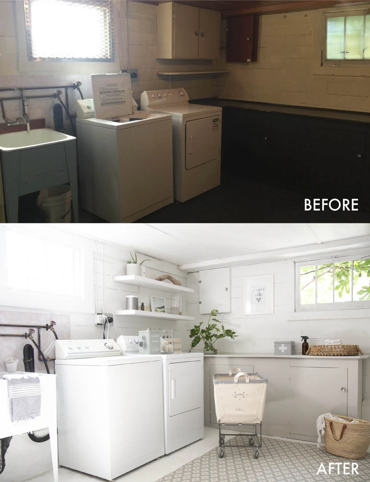
TA DAA! Before I get ahead of myself, let’s rewind a little and go back to where we started. This project is all about progress over perfection, as the house itself is so beyond perfect that you simply have to overlook the things that we will not be changing in a rental and aim for better. It’s been the perfect project to sum up 2020! You can see the inspiration and plan for this room here.
If you’re anything like me, I like the before and after view RIGHT next to each other photographed in the same way so that I can see the differences. If you are a pure before and after devotee, and are happy to overlook the ugly wall lino above the sink and the piping that we left, here you are! I truly wanted to photoshop the wiring out, but I left it in to show you the real deal.
So, there we have it. A whole lot of paint and a few super pretty accessories goes a loooong way to transforming a dark, dire and overlooked basement laundry room. This is now a place I actually enjoy spending time in: the light shines in, it’s super functional (a bench to fold on!) and I can commit to ensuring the laundry actually stays down here rather than making its’ way to the living room floor (making me a happier Mama and alleviating clean laundry in a basket on the floor). If I sound over-excited about a laundry room, I truly am!
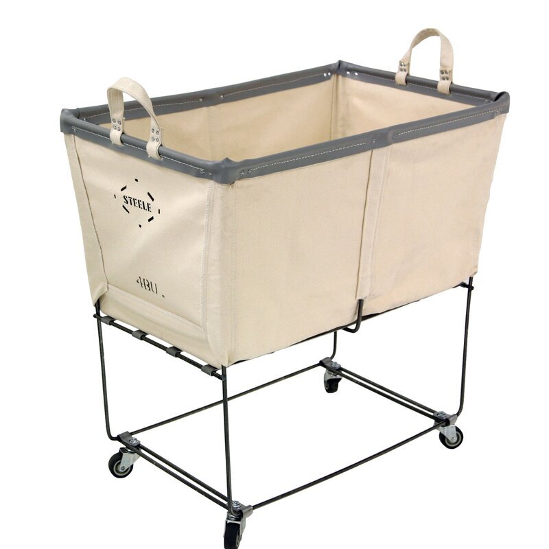
Another thing I’m super excited about is the rolling laundry cart. I have seen this in numerous dream laundry spaces and decided to splurge to have a little bit of luxury in this basement space. I do not regret it for one minute! I chose the elevated cart (size small) to save my back and I really think it makes a difference when leaning over to get the laundry. It’s ideal if you have a standing place to fold and somehow feels extra special compared to a standard laundry bin.
Styling the floating shelves were one of the best parts. While the large cabinets that were already here hold most of the regular laundry room stuff, the shelves provide a bright and airy way to showcase the everyday things, cover up the ugly panel behind them and hold our favourite Sonos speaker (if you’re wondering what that silver item is). I found the art print from Juniper Print Shop and it was so simple to print out and frame!
If you’re still reading, thank you. Who knew that this dingy basement room could become something so bright and happy?! While laundry is hardly on anyone’s list of favourite things to do (or at least not on mine!), I printed this ‘washed with love’ sign to remind myself that we are indeed so fortunate to have three little ones to do laundry for and a happy place to do it in.
RENTAL HOUSE: THE KIDS' SCHOOL AT HOME ROOM REVEAL!
I can hardly believe that today’s reveal has the words ‘home’ and ‘school’ in it. I can honestly say that I never expected to be repurposing an entire room in the house to be dedicated to our kids’ learning. The kids have been home since March and as of now, we aren’t sure whether school will resume in its’ regular form this coming September.
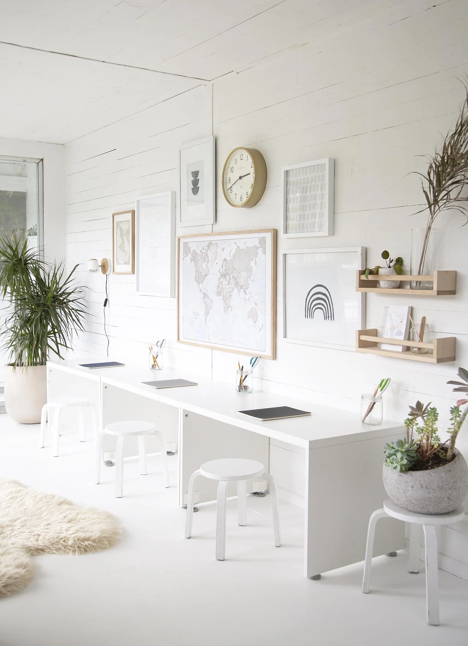
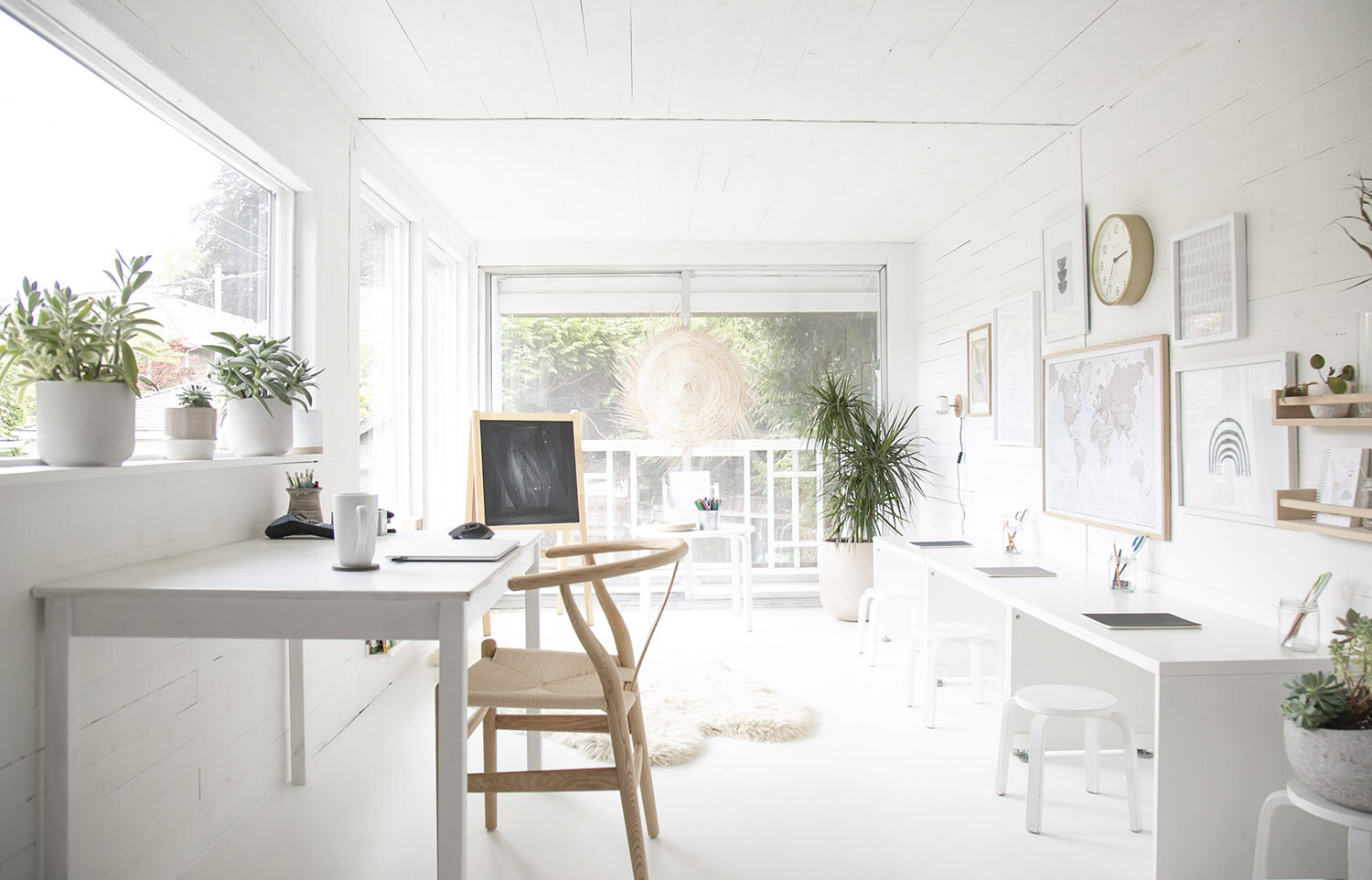
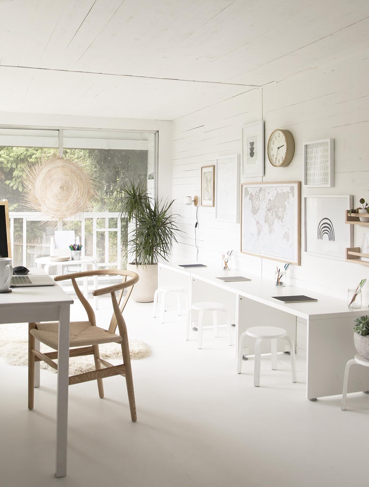
This room is as simple as a room gets (see the before and in progress here), but it’s amazing what a big impact white paint and a good ‘ol gallery wall can have!
With that, let me introduce you to our new ‘school at home’ room!
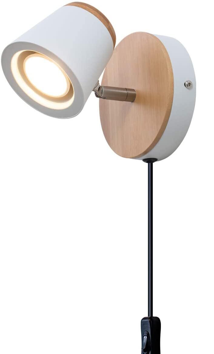
SHOP THE LOOK…
Okay, I love a good before and after so I had to add the original photo I took the first time we saw the rental back in, just to show you the comparison. What do you think?
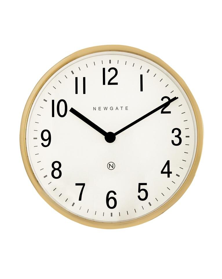
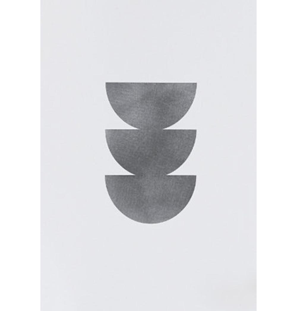
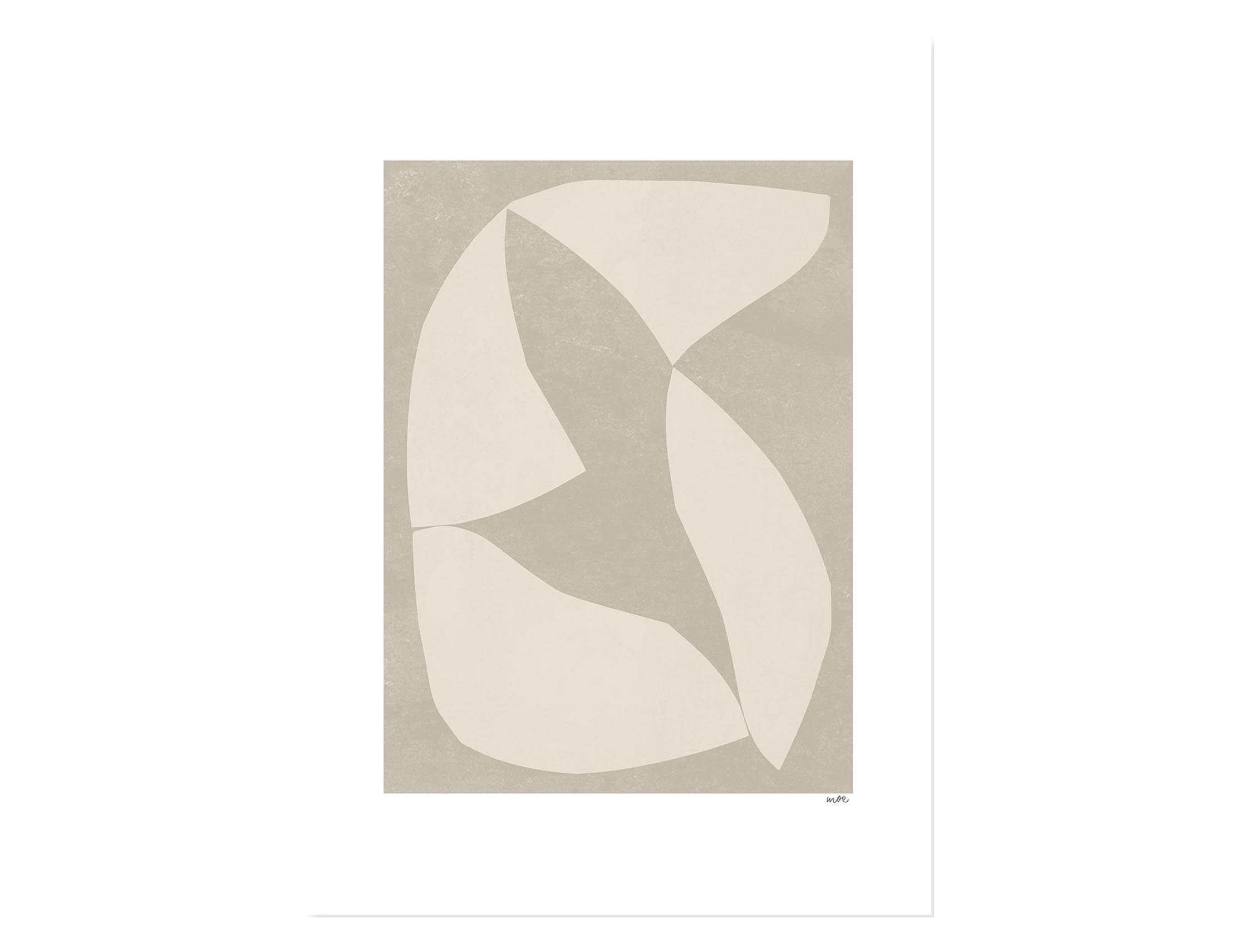
A wall clock was a key item on my list for the gallery wall because our kids have just learned to tell the time with an analog clock, and this gold one is so cute! The world map was another thing I have wanted to hang in a space the kids could see for as long as I can remember. We talk about geography all the time and this map is the perfect one for quick and easy hanging. The square frame is leftover wallpaper from Xavier’s room and the print on the top left reminded me of 3 snack bowls, which I feel like I am constantly filling for the kids. Ha.
The light in this space is truly the best part, with sun shining in each morning. It’s the perfect place for plants to thrive and the kids love to help water them each week.
SHOP THE LOOK…
RENTAL HOUSE: PROGRESS ON OUR HOME SCHOOL ROOM
This may be the first progress only post I’ve ever done! While I can’ t wait to reveal the finished space, this room in our rental house is particularly unusual and so I thought the before and in progress deserved an entire post of its’ own.
While I’m dreaming of it looking as polished and fresh as this gorgeous kids desk area below, there are still a few more things to add to get it to the finish line.
Source: Shira Bess Interiors
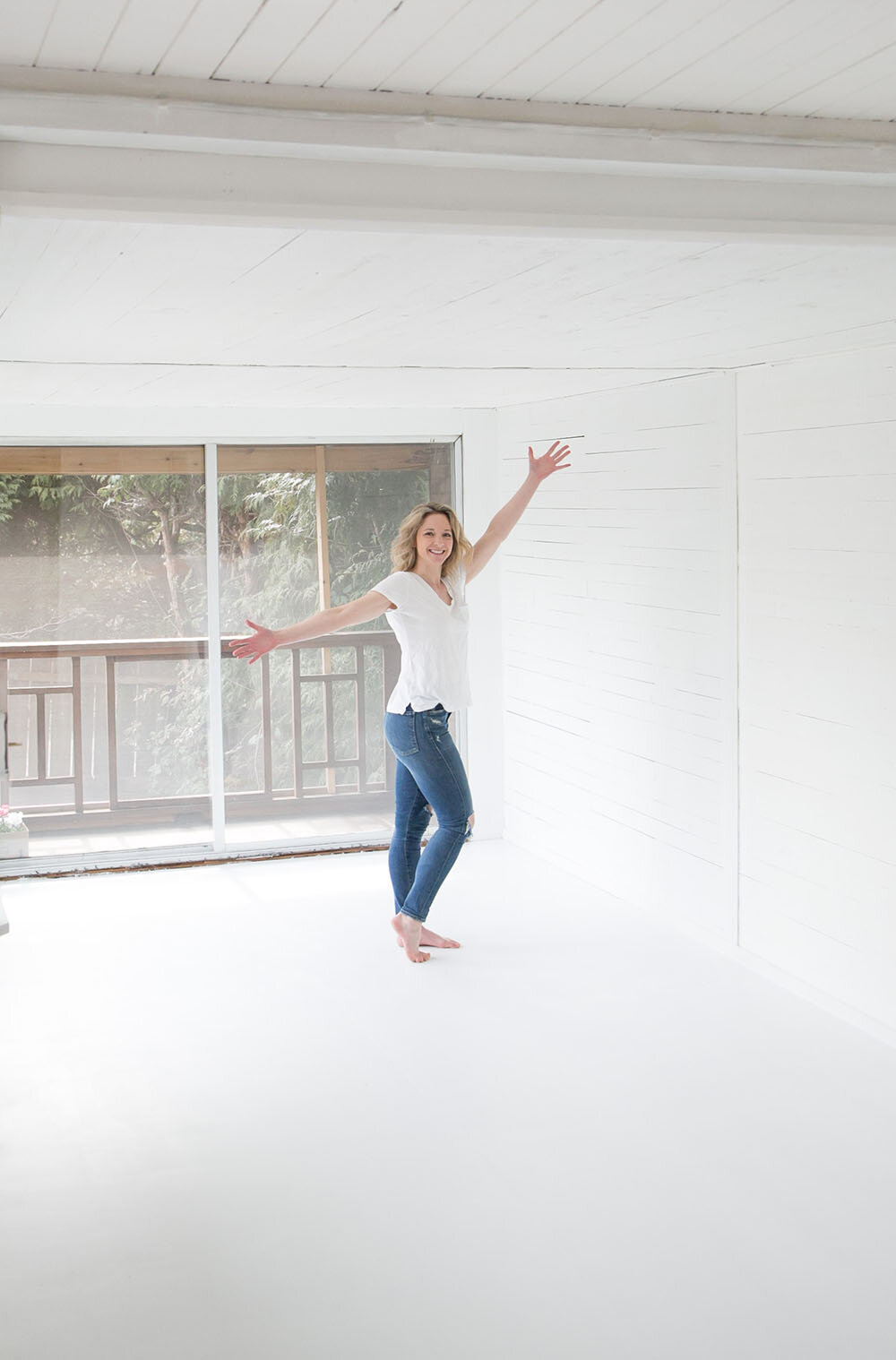
Let’s start at the beginning. If you haven’t already, head over to the blog post that introduces our rental house to see all the spaces that are being freshened up. Below is the space that was originally going to be my office when we rented this house. Raw wood, carpet, a boat wheel and windows of all shapes and sized. It’s a terrible extension that was not added on properly but the morning light beams into this space so I knew we needed to use it for something useful.
The floor is slightly sloped (yes really!) but we knew that we wanted to rip the old carpet up as soon as possible and see what was underneath. Given the slope, there really weren’t many options for coverings. We decided to remove the carpet glue and sand the solid wood floor that forms the entry to this space and then use plywood to cover the remainder of the room.
Once everything was sanded and the new plywood was laid, paint was the next step. We used Benjamin Moore Super White throughout. It’s amazing what a few coats of white can do to clean a room up!
And…voila! A whole new starting point. Come back next week for the full reveal of this room!
RENTAL HOUSE: OUR FRESH & BRIGHT DIY BOOKSHELVES!
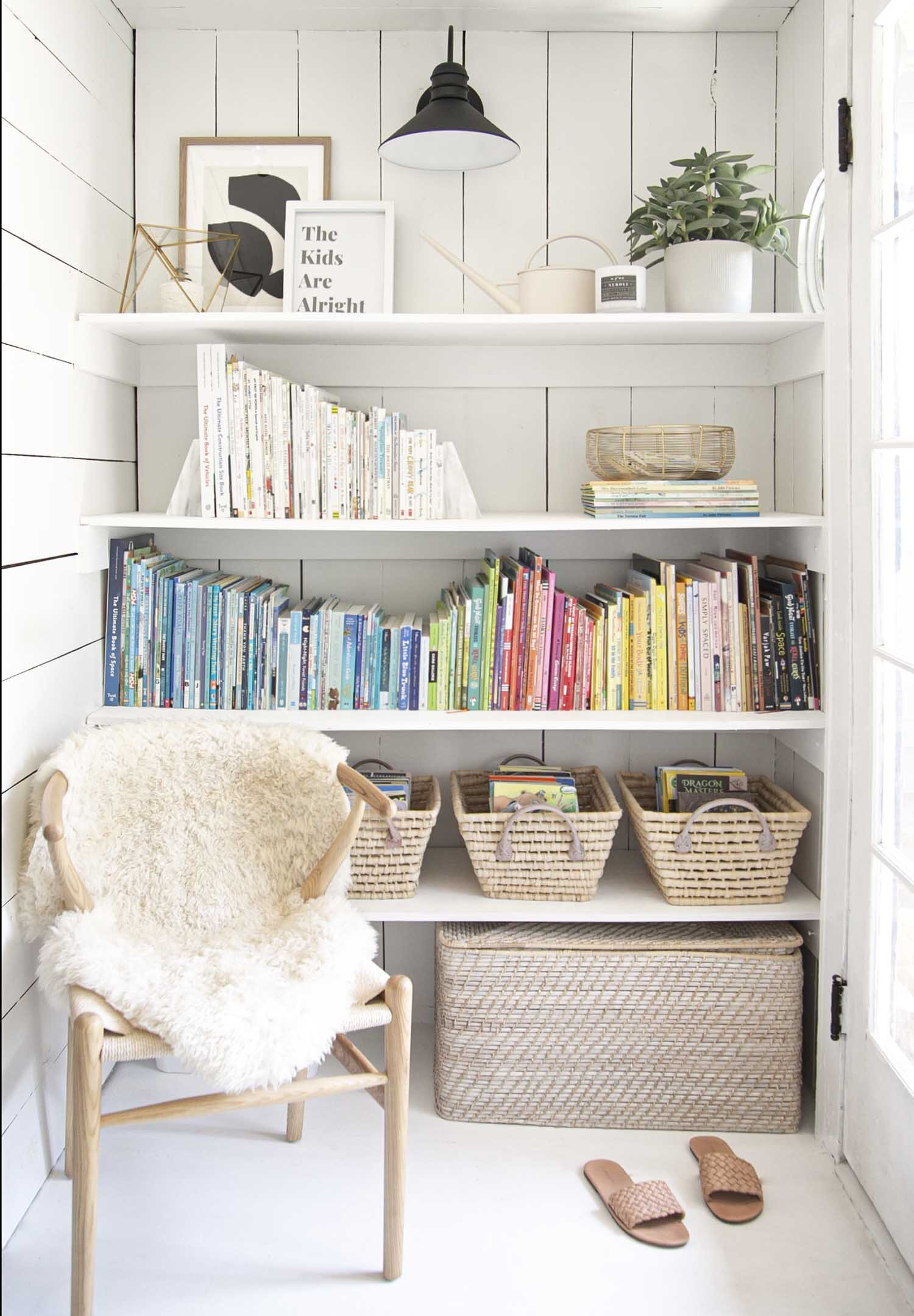
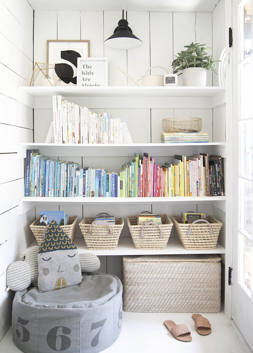
It’s done! It’s a super simple design, but this DIY bookshelf in our rental house is finished and functional! Just inside the main floor back door and around the corner from the new ‘school at home room’ (reveal coming soon!), we now have a functional, fresh and bright place to store a good chunk of our children’s books!
SHOP THE POST…
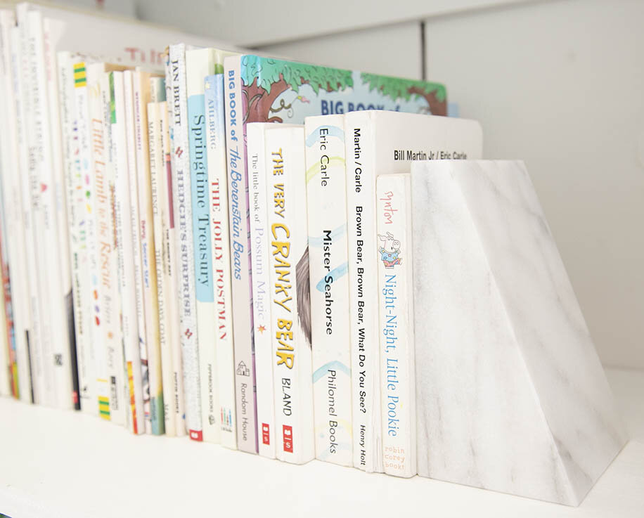
If you’ve been following the blog for awhile, you’ll know that I LOVE kids books. However, I truly don’t love how much space they take to store! They seem to make their way into every room in our house. I was determined to find an area that could store more books and act as the key area we keep the books (the kids still have a few faves in their own rooms).
Let’s go back to where we started. Below left is what this exact spot looked like when we moved in! Because it sits next to an exterior door (which you can see on the right of the photo), we quickly hung simple hooks and put a shoe rack underneath. As you can imagine, this area became a hoarding spot for all things dirty and messy very, very quickly. Just a few weeks ago, we created this super simple bookshelf. You can see in the picture on the right how it looked before we added two more coats of white paint.
I wanted to create a fresh place to store a decent number of books for the kids and provide them with an extra spot to plop down with a good book. It helps that this area is right next to the room that we are currently using as the school at home room so that someone can go and sit and read when they are not feeling like doing ‘work’.
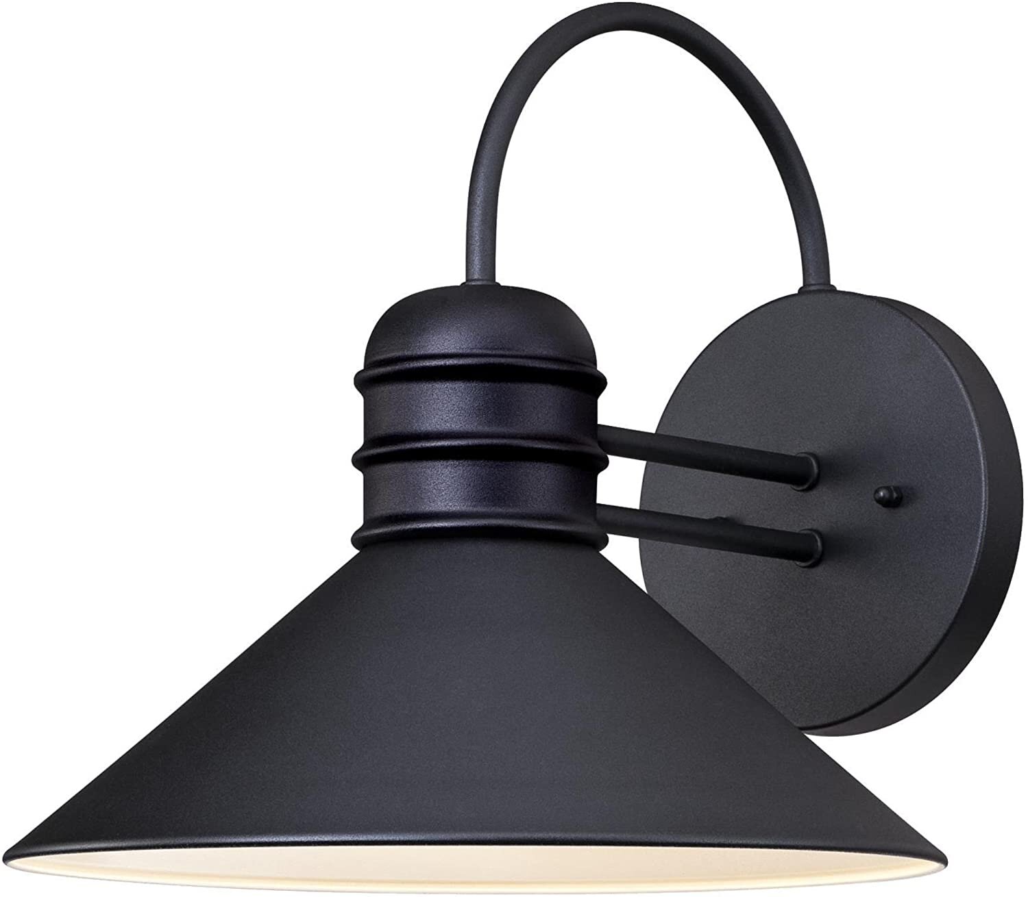
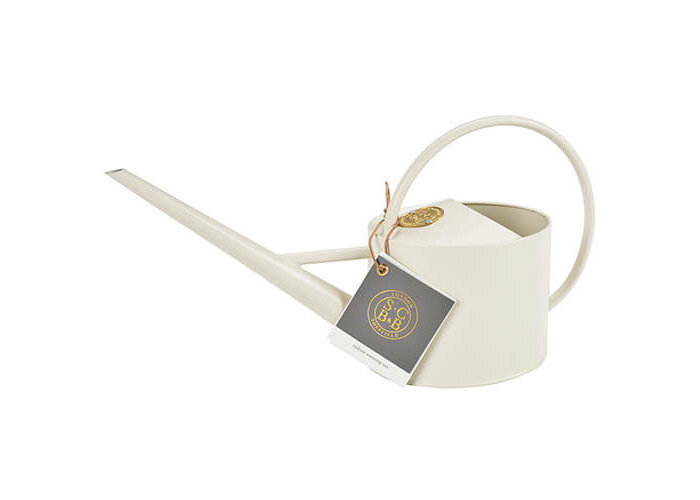
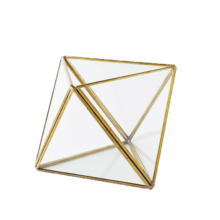
The remainder is all styling! I wanted the top shelf to feel pretty and also store a few fun things, like the terrarium and my new watering can, which I love. I also popped this typography print up there to remind me throughout the day that whatever happens through this pandemic, the kids are alright. We hope! Ha. The wall sconce adds impact and functionality so that even on dark winter days, it’s still a well-lit area to read a book.
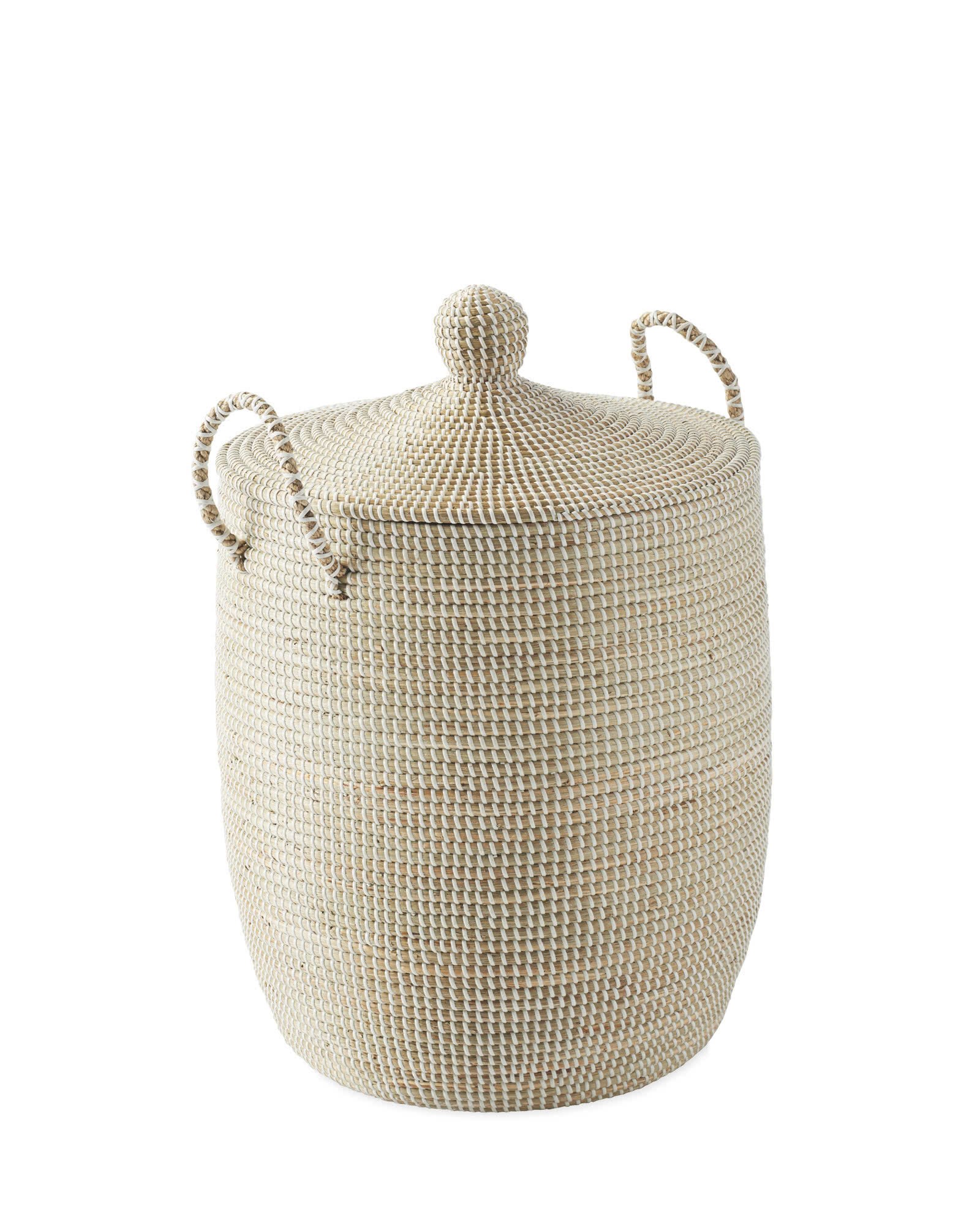
This extra large basket is a necessity for storing shoes that are not in season. I love that it has a lid to keep the look streamlined while adding extra texture to these plain white bookshelves.
YOU MAY LIKE THESE POSTS TOO…
RENTAL HOUSE: OUR TWIN GIRLS' SHARED ROOM!
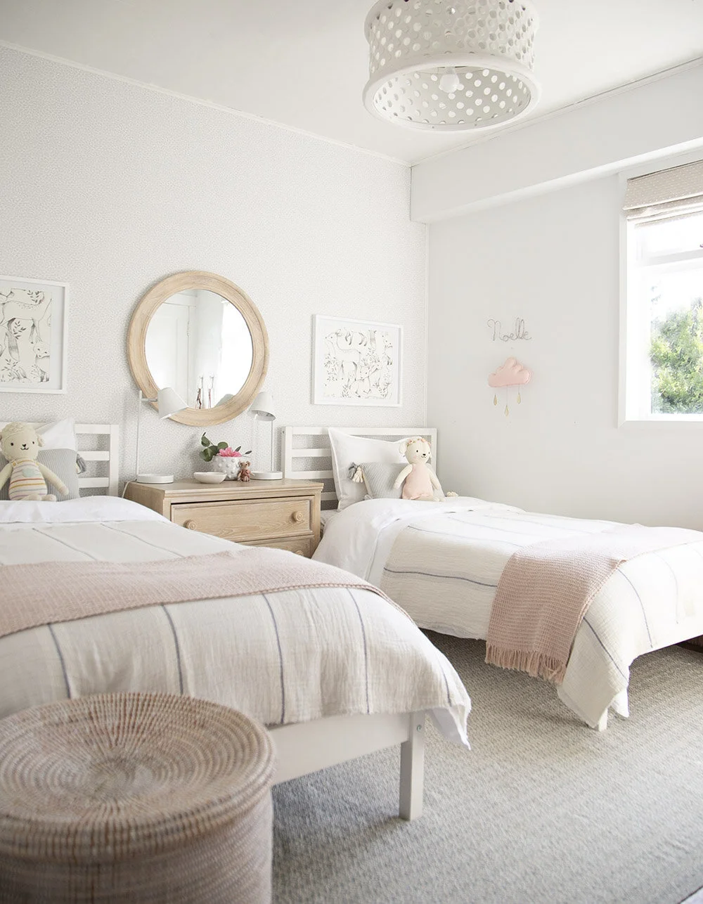
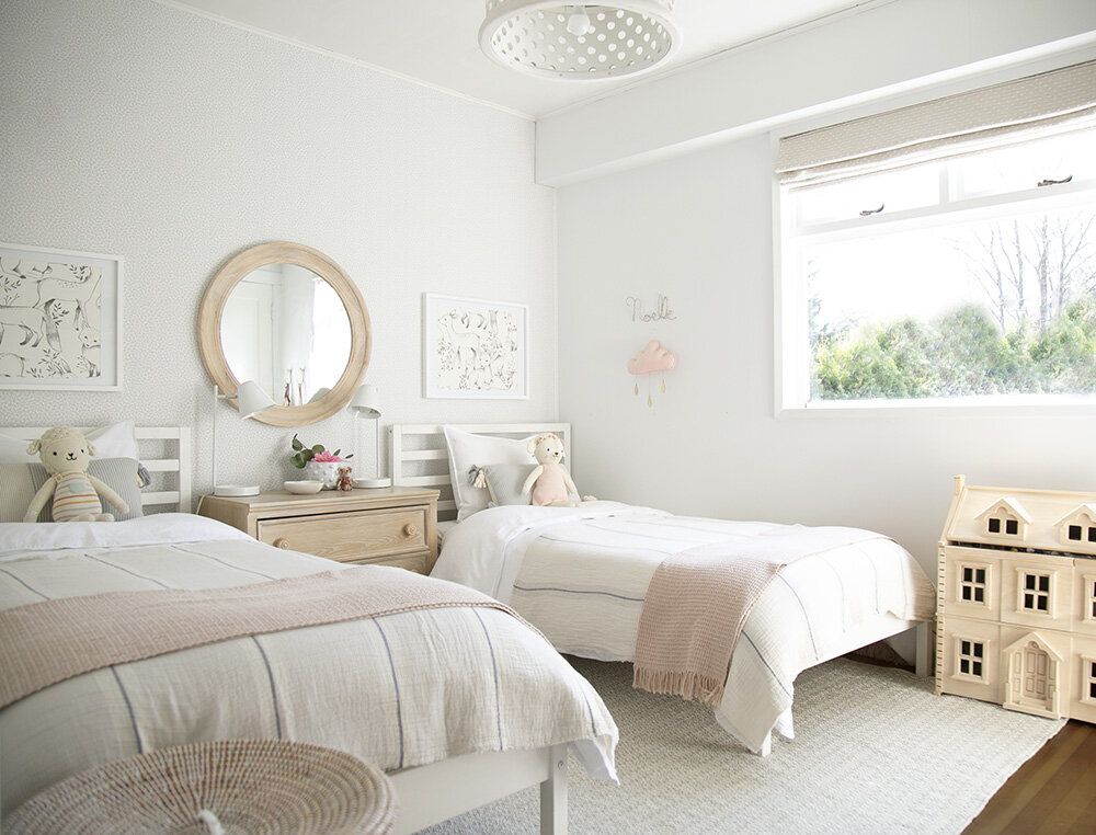
Well, here we are…the second room reveal of the rental house!!! If you caught the before photo in last week’s post of this space, you’ll remember that one twin wasn’t too thrilled about moving into that room. I’m happy to report that with a little re-decoration, both girls now love this space!
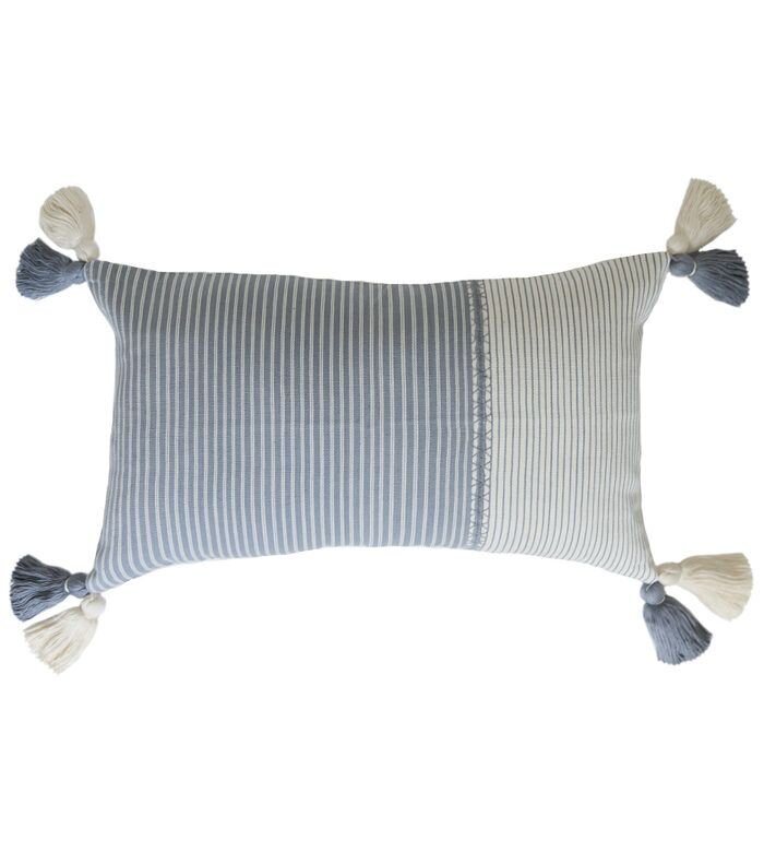
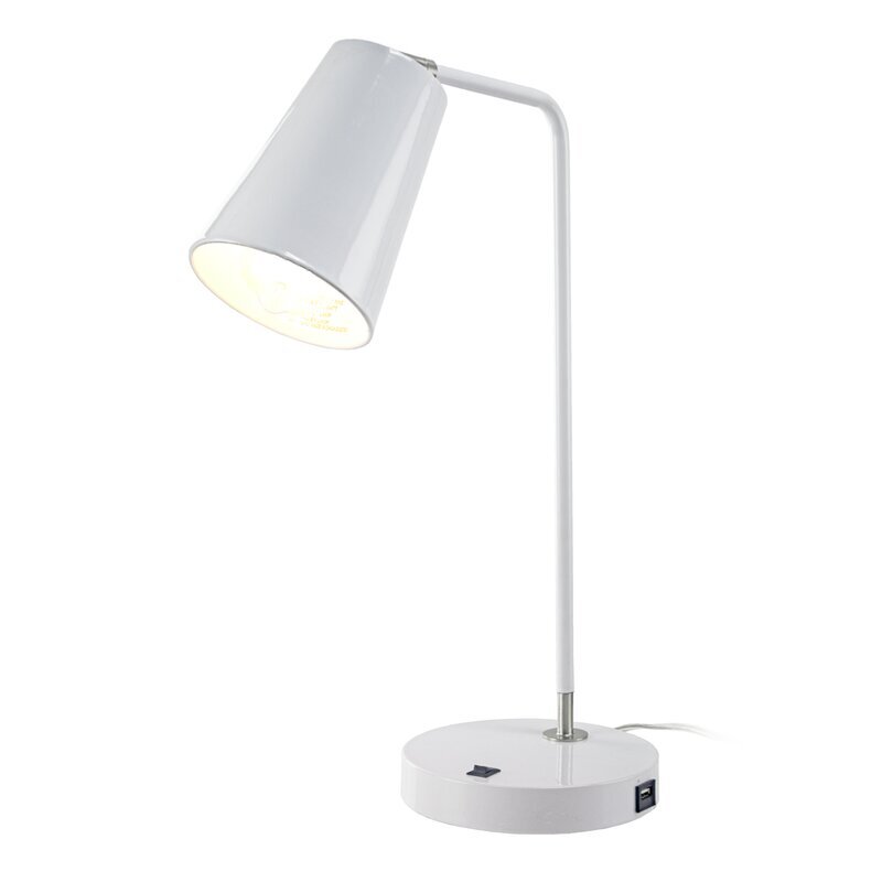
SHOP THE LOOK…
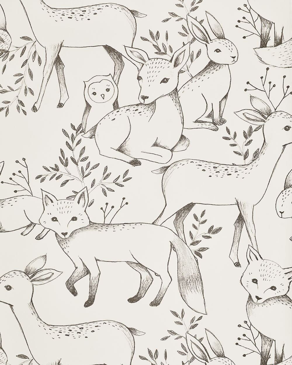
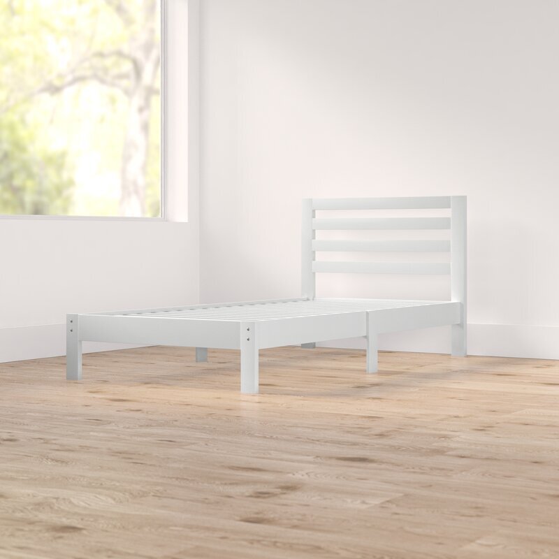
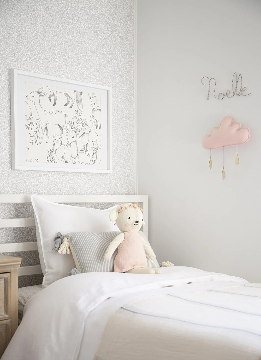
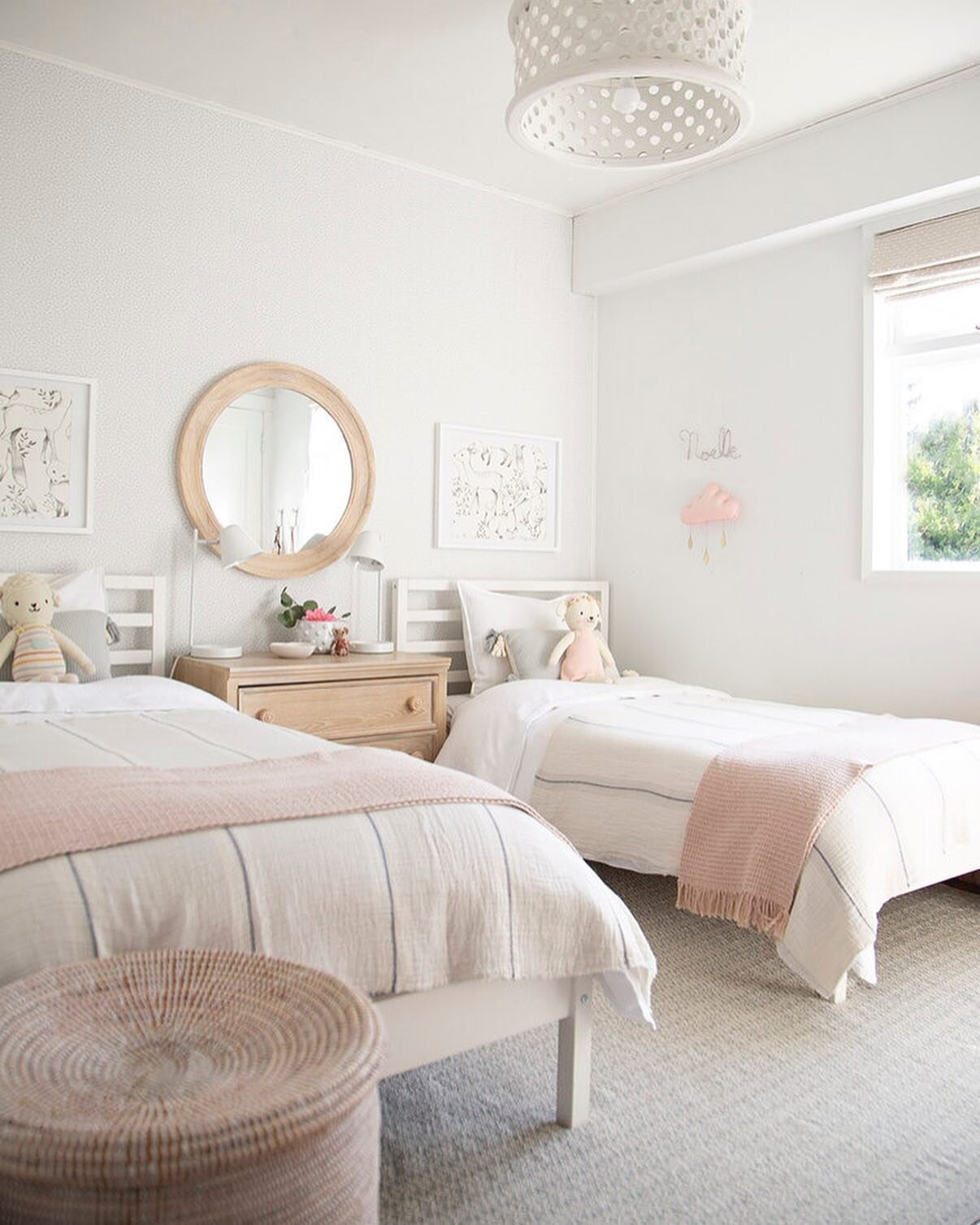
What started with a super basic room (and still is) has turned into a pretty and fresh space for my sweet girlies to make their own memories in. As with so many before and afters, a fresh coat of paint was a big help. I hesitated in sharing this room because the beds didn’t feel right. We have had these Ikea wood beds for a while now, waiting until we move into a permanent house where we could transition the girls into bigger, more substantial beds. It didn’t seem worth buying interim ones for this rental house, so we just painted them white and kept them as is. The pictures in the frames have been swapped out a few times, but the girls love these forest animals, so this is where we’ve landed for now.
After a full coat of paint, then adding a wall of wallpaper, the focus turned to finding enough space for a little storage. This dresser is more traditional than my typical style, but it was the exact fit for a functional side table and clothes keeper between the beds. I just love how the simple round mirror pulls the big wall together. The sweetest little lamb and bunny are from Cuddle + Kind, one of my favourite Canadian companies, who donate 10 meals to kids in need for every doll purchased.
You might have spotted these bookshelves before in the post about how to style your kids’ shelves. I still love the simplicity of these white metal shelves and recommend them for storing books and pretty things anywhere in your house.
In this next photo, you can see the window side of the room. This is South facing and lets in a lot of light! While I typically wouldn’t add custom shades to a rental, it was an absolute need to have blackout for this window. I just LOVE how these turned out and really feel that this fabric gives the space a little bit of a special feel. They are from Tonic Living, who were a joy to work with. You can also find the rug here.
The wood dollhouse is on my gift list each year and has been a firm favourite with our girls for a few years now. It is a big hit with play dates and I’m always amazed by how long our two girls play with it independently. The hooks are old from Anthropologie and the purses are from a trip to Australia. Above right are my sweet girls who I am so lucky to have been able to decorate this room for! Credit for this image goes to my patient husband who took the kids out of the house during quarantine so that I could shoot the room and then came back and snapped this photo for us.
In case anyone thought that their room looks like this all the time, please know that a styled shoot is just that! The second they walked in the door, the girls were up and jumping on their beds as usual and soon enough, the trinkets will be back on their dresser and shelves. After all, pretty spaces become even more beautiful when they are lived in and loved.
IF YOU LIKED THIS POST, YOU MIGHT LIKE THESE TOO…
HELLO!
WINTER DAISY was created when Melissa Barling was laying on the couch while pregnant with twins. She dreamed of a beautiful baby room but couldn't get up and make it happen. The babies were born and in those mid night wakes and early morning feeds, she decided to leave her corporate job to start a design studio + blog. Welcome to WINTER DAISY.
Follow along on Instagram
POPULAR POSTS...
CATEGORIES
- BOOKS WE LOVE
- BOYS ROOMS
- DESIGN TIPS
- DIGITAL
- DIYs
- EFFICIENT MAMA
- FAVOURITE FINDS
- FREE PRINTABLES
- GARDENING WITH KIDS
- GIRLS ROOMS
- GIVEAWAYS
- HELLO
- HOLIDAY
- HOMESCHOOL SPACES
- HOW TO...
- I'M MELISSA
- INSPIRATION
- KID STYLE
- KIDS ROOMS
- MINI GATHERINGS
- MY FAMILY
- NURSERIES
- OH MONDAY!
- ORGANIZATION
- PICKS
- PLAYROOMS
- RECIPES
- RENTAL HOUSE
- RENTAL HOUSE #1
- RENTAL HOUSE #2
- RENTAL HOUSE #3
- REVIEWS
- ROUNDUPS
- SHARED ROOMS
- SHOPPING
- SHOPS WE LOVE
- STYLING
- TODDLER ROOMS
- TRENDS
- gift guide
SUBSCRIBE
Disclosure
WINTER DAISY BLOG contains affiliate links as well as advertising banners. I may receive a small commission on purchases made through links from this site. The content is always reflective of items, things and experiences that I genuinely like and I only work with companies whose aesthetic is in line with the WINTER DAISY brand.
Sponsored posts will always be clearly disclosed.


