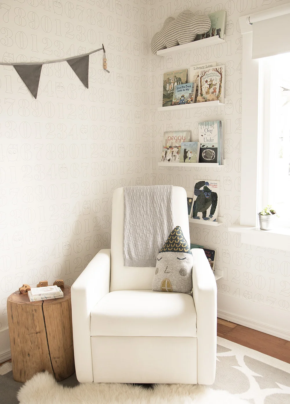
A NEUTRAL NURSERY {& HOW TO STYLE TO SELL}

Organic and neutral baby nursery in Vancouver

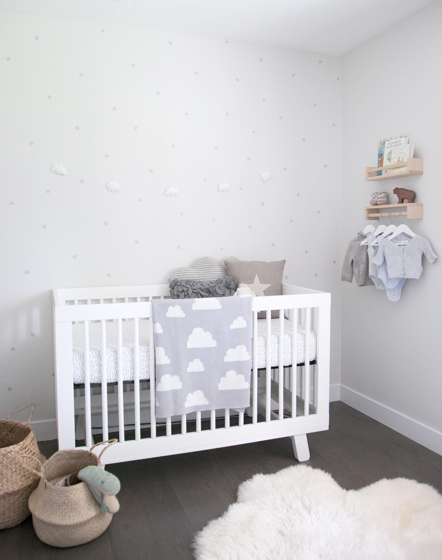
If you've been following along on my Instagram over the past couple of weeks (and if you don't, come follow!), you'll know that I've been busy decorating a new baby nursery. Well, this project is different than any I've done before as it is set up in a house to sell!!! That's right, this neutral baby room was set up entirely for staging a home.

Other than sharing the nursery reveal, I thought it would be fun to share how the space came together, how my thought process was different for this space given it is set up temporarily and most importantly, how to style your nursery to help with selling your home!

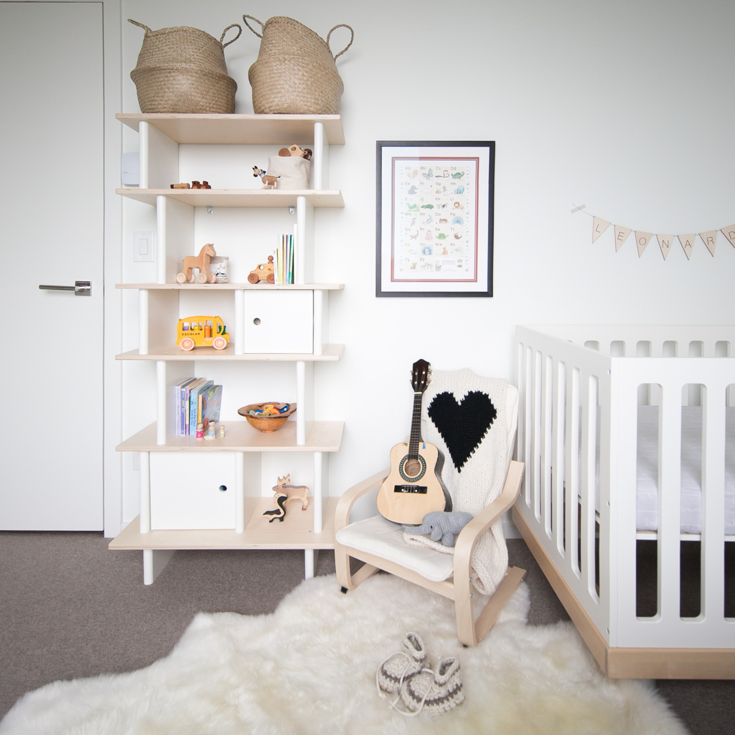
I started with two key pieces of furniture: the crib and the ladder shelf. Given the room is set up so temporarily, I left out a chair although if this space was going to be used with a baby, I would have moved the crib over and added one in. 

Here are my key tips for styling your baby's room for sale.

pillows in baby nursery
cloud mobile

Keep colours neutral:

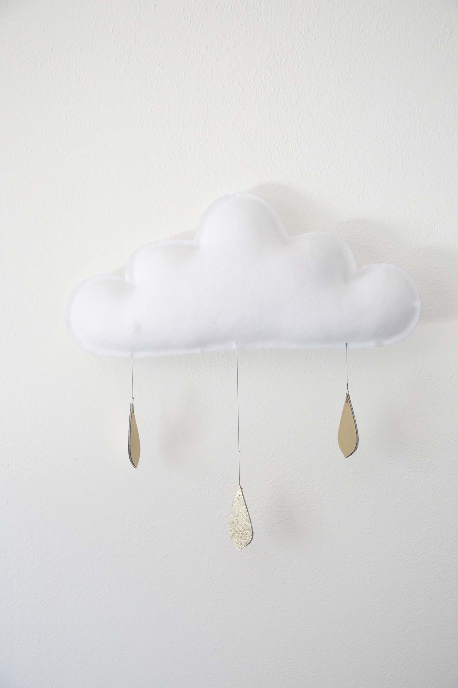
When I saw the room, I knew that a simple white crib would be perfect and this one from Babyletto fit the space well. A white crib works perfectly for either gender and I wanted to keep the space neutral so prospective buyers could envision a baby boy or girl in the room. I just love this cloud mobile from The Butter Flying. This colour palette works equally well if you are setting your nursery up and waiting for the big day for a gender surprise too.

A simple white ladder shelf in a children's room

Make the most of the space but leave options: 

My goal was to make the small room feel bigger, to highlight how babies only need a few things and to show that by keeping the clothes organization elsewhere (there is a built in storage solution in the closet), you can keep the room tidy and calm. Although this space is quite minimal, this also enables the new owners to see that they could add in some of their own personal touches easily (such as a special photo on the wall or some art). The key here is to keep the paint soft and bright, bring in just enough furniture to give an idea and leave the window coverings open to enhance natural light.

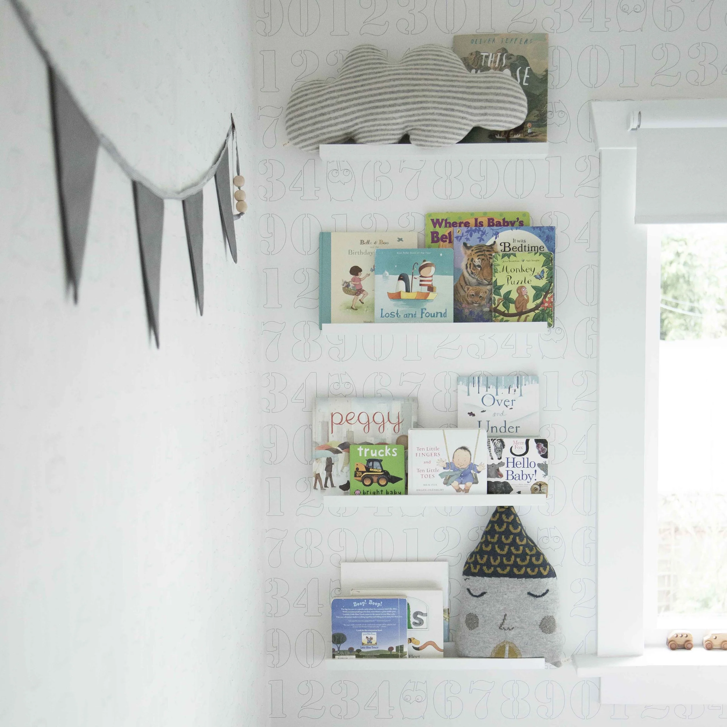
shelves with baby clothes, books and toys in kids nursery

Add in some personal (but not too personal!) touches:

I wanted the prospective owners to feel connected to the space when they walk in. A few sweet baby outfits hanging usually bring the oohs and aahs and adding books and some simple toys could helps parents envision sitting and reading to their baby in this space. These little details also made me dream of snuggling a newborn again!!! 

If you love the soft, organic, neutral vibe that this nursery has, you can find all of the details to shop the look below. 

Design board for a neutral nursery

01. // White ladder shelf; 02. // Irregular dot decals; 03. // Wooden book shelf; 04. // Mama brown bear; 05. // Babyletto white crib; 06. // Cloud felt garland; 07. // Large soft sheepskin; 08. // Seagrass belly basket; 09. // Linen star pillow.

IF YOU LIKED THIS POST, YOU MIGHT LIKE THESE ONES TOO...

HOW TO GET YOUR CHRISTMAS CARDS DONE EARLY!

WINTER DAISY blog christmas cards with mixbook

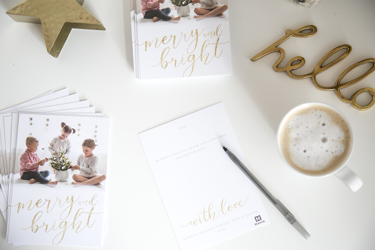
I know, I know...a little early, right? Christmas cards in November??!! Trust me when I tell you how great it feels having these done and dusted (SO great!). I always love receiving Christmas cards from our friends and family all over the world but I am definitely terrible at getting our own Christmas cards written and sent. Big thanks to Mixbook, this year is different! It can be for you too!!!

WINTER DAISY Christmas card photo 2016

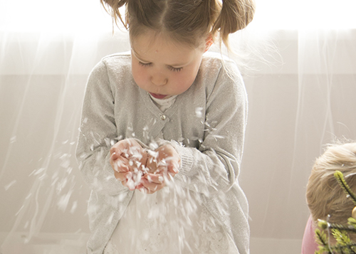
The process was SUPER simple and therefore completely doable (even with three toddlers!). Here is how we did it: I chose a simple backdrop of a window in our house, added some gold stars from Pearl & Jane and snapped away. As you all know, once kids are involved in photos, getting the ‘perfect’ shot gets a little harder and instead of creating a stressful moment, I wanted this to be fun. We put on Christmas music, I gave the kids some little gold ornaments to decorate the tree with and also handfuls of pretend snow. They LOVED the fun and I got some cute shots!!

kids throwing snow
little girl blowing snow
xavier cute smile
kids

I then looked at all the Christmas Cards (I chose from hundreds of professionally designed card themes that you can personalize in any way you like) on the Mixbook site and selected these super pretty and festive gold foil Merry and Bright ones! Aren't they sweet? Simple and so easy to customize to fit any photo that you have taken. I love how they turned out!

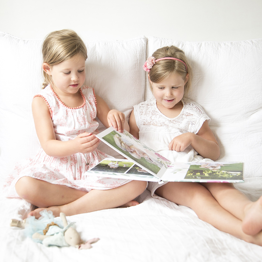
As you're choosing your holiday card, there are so many other products available to peruse while you're at it. From custom calendars to canvas prints and photo books similar to the summer one I showed earlier in the year, they have you covered!

WINTER DAISY 2016 Christmas Cards with Mixbook 

Shipping was quick and I was really happy with the thickness of the premium paper and quality of the cards. Next up is actually writing them! I recommend making a coffee (or pouring a glass of wine!) and just doing it. Such a great way to get ahead for the holiday season and make a nice big tick next to 'christmas cards' on the list.

Vancouver children's interior designer Melissa Barling's office

Good luck friends!!

Mixbook is kindly offering 10 free flat cards. Use code FREE10 to redeem.

*This holiday post was created in partnership with Mixbook.


ONE PIECE GROWS: CRIB TO BLANKET LADDER!

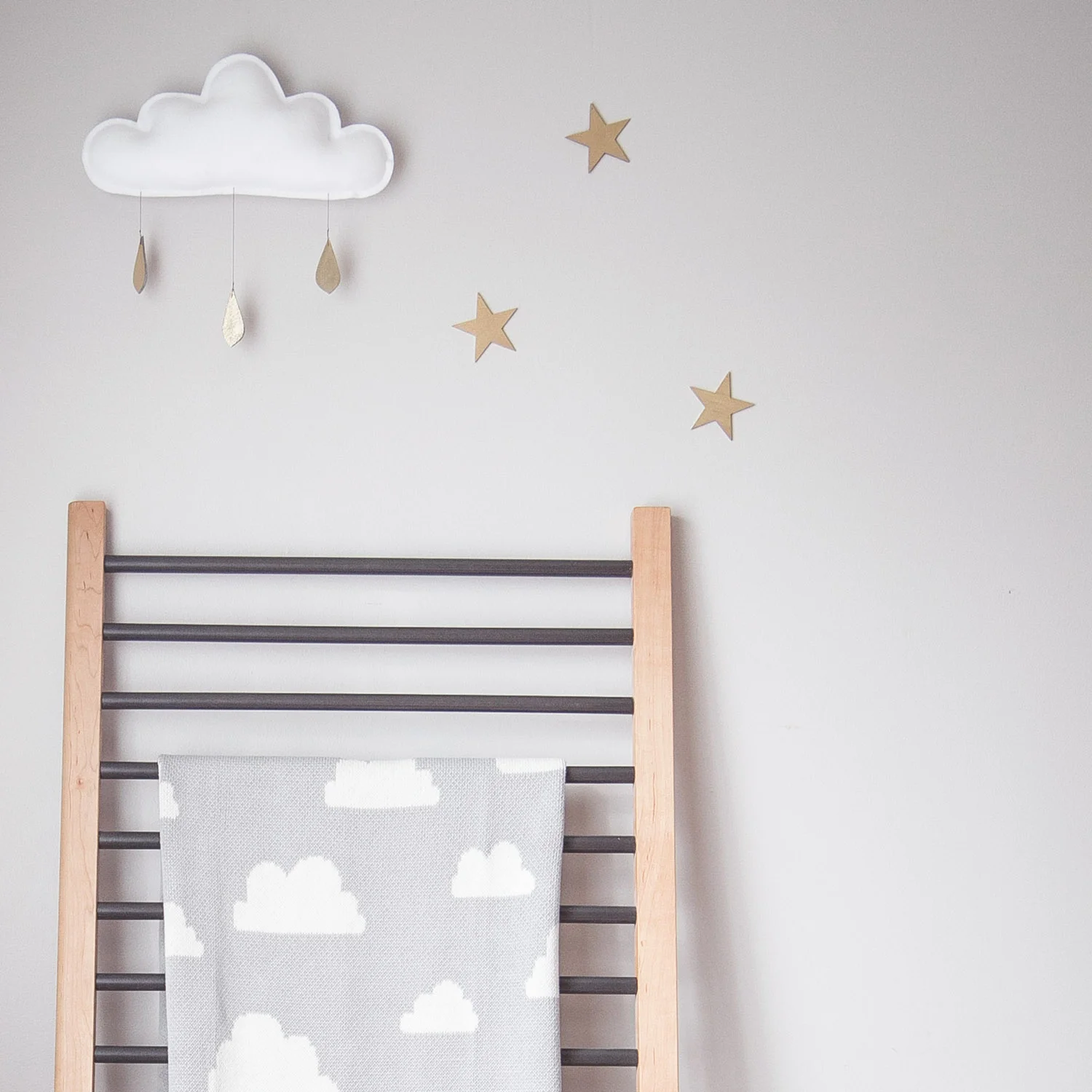
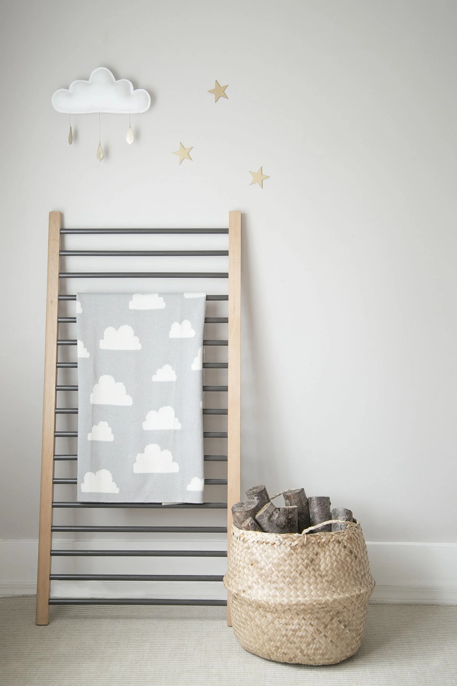
sweet cloud blanket with cloud mobile

(Cloud mobile by The Butter Flying, Cloud blanket by Humbleweave)

Last month, I went through all of our kids' clothes and toys from the past five years and got rid of everything that I didn't think we'd need anymore. To say that this was an emotional experience is a severe understatement...I had no idea I would be so sad to part with those tiny pieces that all of a sudden signified SO MUCH!

Well, thankfully, I am still holding onto our Kalon Studios Caravan Crib. I just can't part with this crib...I'm not sure if it's the significance of it being for our third baby or whether it's just the beautiful design but I don't have the heart to sell it. 

Soooo, I figured I should put it to good use and show you what I'm using it for now as you may be in the same position as me with having a crib side laying around that could be put to good use as a blanket ladder!

Let's take a look at how beautiful it was when Xavier was a baby and the crib was being used in all of it's glory and also how sweet it was as a toddler bed after that. Perfection, right?

Caravan Crib in interior designer Melissa Barling's children's room
Kalon Studios toddler bed in Vancouver Interior Designer Melissa Barling's son Xavier's room

Well, this next idea happened long after Xavier's gorgeous Kalon Studios Caravan crib was dismantled and the toddler bed was being used in our playroom as a daybed for the kids, as below. 

playroom designed by WINTER DAISY KIDS

I had this novel idea that the rest of the crib could be used too...and so, in order to make the most of this beautiful piece in its' entirety, the sides have been turned into a blanket ladder, with Humbleweave's gorgeous cloud blanket showcased and ready to use.

crib side blanket ladder with humbleweave blanket

What do you think? Would you use your crib side as a blanket ladder too? 

*This post was created in collaboration with The Butter Flying and Humbleweave.

IF YOU LIKED THIS POST, YOU MIGHT LIKE THESE ONES TOO!


HOW TO CREATE THE PERFECT BOOK WALL

book wall kids room green
book wall in kids room
book wall in monochrome boys room

You know I love them! You've seen them in nearly all of the rooms that I create and in nurseries and kids' rooms around the globe...book walls are absolutely art for your children's rooms!

In this post, I wanted to share how amazing book walls look, how versatile they are for you and your kids, how to create one that will work perfectly in your own child's room and where to find some of the key shelves that you see on popular blogs and magazines to use on your own.

book wall in toddler boy room

One of the best things about book walls is the versatility; they can be used purely for books or for display of toys which can be rotated or special items for play. These ledges provide open access for your children and encourage reaching for a book or toy, whichever is placed at their height. I also love how special (or expensive) books can be stored out of reach, allowing the parents to choose which books get chewed on or read most.

book wall in neutral toddler room

The key is to mount them with enough space for your tallest books. I like to space them between 15-17" apart vertically, allowing space for books and for your eye to have a bit of white space. Make sure to hit a stud in the wall or use an anchor to ensure that when kids pull on the ledge, it won't budge. 

Ubabub book wall in baby girl nursery

When I specify book walls for clients, I have specific go-to sources, which I've listed below especially for you! I love the way the clear acrylic shelves from Ubabub help to highlight the beauty of the book covers and how these tiny white shelves help to fit into small spaces. 

book ledges or shelves for kids room

01.// White picture ledge; 02.// Dark book ledge; 03.// Wooden bookshelves; 04.// Gold book ledge; 05.// Clear acrylic shelf; 06.// Grey book ledge; 07.// Dark book ledge; 08.// Tiny book ledge.

If you loved this post, you might like these ones too!

5 WAYS TO USE WATERCOLOUR IN CHILDREN'S ROOMS

watercolor duvet cover


Watercolour has long since been a medium for artists and the trend has certainly paved its' way into home interiors in a BIG way too! I love all things watercolour and realize that I often reach for it when i'm at a shop looking around. 

Part of the fun of kids' spaces is getting to try out trends in a small or big way. See how you can use watercolour in your own children's rooms below.

1. Wall Decals (via Urbanwalls)

watercolour decals in bedroom

Wall decals are such an easy and effective way to change the look and feel of a room and these watercolour decals add a soft and lovely feel to this teen bedroom. If you don't think you'd love this forever, don't worry...just peel off!

2. Art Prints (via Etsy)

With so much emphasis on kids rooms, it's no surprise that kids art has become incredibly popular too. Watercolour prints have always been and will continue to be big in kids spaces (so much fun to make prints too!).

3. Wallpaper (via mommodesign)

cactus wallpaper in kids room

This cactus wallpaper by Anewall has become a fantastic way to add colour to a modern monochrome kids room and shows how watercolour can be used to create HUGE impact.

4. Sheepskin Rug (via Lulu & Georgia)

sheepskin watercolor rug

Why not add a splash of colour while adding a soft sheepskin to your space? This watercolour sheepskin rug is truly unique!

5. Blanket (via Etsy)

watercolor blanket

A blanket is the perfect way to add a bit of watercolour to a baby nursery, and this one is so sweet. 

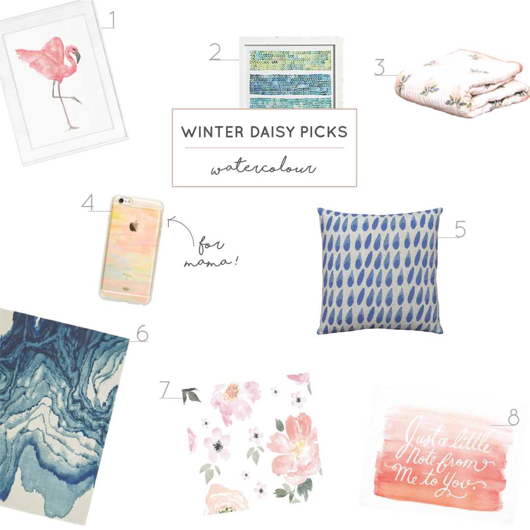
What do you think? Could you see yourself using watercolour in your own home decor? If you like the idea of adding a few watercolour items to your kiddies rooms, I've rounded up some of my favourites below. 

WINTER DAISY picks watercolor

01.// Flamingo Art Print; 02.// Watercolour Wall Print; 03.// Watercolour Quilt ; 04.// Watercolour phone case; 05.// Watercolour Raindrop Pillow; 06.// Watercolour Rug; 07.// Watercolour Wallpaper; 08.// Watercolour Note Card.